Vif Art Sketchbook First Impression

Recently I found this sketchbook at local art store , Overjoyed. If you have watched my previous youtube video, I have done a short vlog about this art store, you may wish to check it out from my channel.

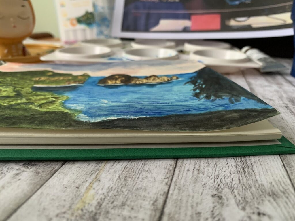
This Vif Sketchbook came in 2 different format. One is rough (Red cover )another is smooth( Green cover ) . As what I knew from the overjoyed store staff, the smooth type is considered as cold pressed. So Since, I worked mostly on watercolour, I decided to get the cold pressed instead since I love to watch the watercolour react on the surface.

The green cover is sort of velvet feeling and it says ” made in Japan ” . I try to search this on amazon website, unfortunately it doesn’t sell this version, though there are other Vif Art version of sketchbook available.

As it says, it is made of 242 GSM paper and it look much “yellow” than my other sketchbook. S With only 15 leaves and cost SGD 10.50 , I feel it is quite a decent and slim sketchbook to own. It came with a cute cloth ribbon that you can tie it while putting in your bag.I am not sure if it contains any cotton contents, but I doubt so. Let’s talk about my first impression on the paper while painting a mountain scenery.

When I first try on it ,the colour just glide on the surface and it looks quite challenging to apply colours on top. But after awhile, it seems to be ok. But once you apply a layer of watercolour, colours can easily lifted up . So if you make a minor mistake and the paint is not that staining, it will be quite easy to remove it.

Colours look vibrant with few application.But since the paper itself is more to off white, the colours may appear warmer.It can withstand quite a few layer of paint with slight warping. But if you closed the sketchbook with the ribbon , this may not be a big issue. Oh yes, since the book is hardcover, you can flip it to draw easily with support especially if you love outdoor sketching.Overall, I love this cute sketchbook and it is affordable as well. I have the drawing ( time lapse ) process on my youtube channel with the link below.

Posted in Sketches | Tagged , , | Leave a comment

Drawing My First Ever Anime /Manga Character – Link from the Legend of Zelda

This is so much fun and there is so much in depth about Anime / Manga drawing. This is not an easy drawing as so much details to consider about drawing and layering the colour. I do saluted to those artists who are dedicated to manga drawing and hours and hours of drawing details and colouring.

Most artists used mediums like copic markers, coloured pencils and I believe there is a good reason behind for doing it. They are much easier to control and these mediums give good colour vibrancy, clarity to the character. Watercolour may not be a good choice when come to character painting. I almost wanted to discard this initial muddines of this painting and switch to other better mediums. I wanted to explore more using watercolour for this piece and it is not going to be that easy. I can never do it alone by using just watercolour . To give the character’s hair more in depth and more clarity ( which I feel watercolour is not able to give more in depth as I did not inked this drawing), I in-cooperated coloured pencils to give more impact to the hair instead. The one that I am using is the Faber Castell Polychromos Coloured pencils . If you are going to be an coloured pencils artist , this is the set that is recommended to buy.

Even if you are not familiar with coloured pencils , they are so so much helpful even when you are just starting out. I bought this set 10 over years ago and it is still with me today, totally classic coloured pencils.

Most of the time, I don’t use only a specific watercolour paint brand as I feel it is so much fun to mix with different brand. For this piece, I am using Daniel Smith, Roman Szmal and Mission Gold.

FINAL THOUGHTS :

I can start to see that my style is a more loose compared to many professional Manga Artists. I don’t put in alot of detail works but I do focus greatly on the expression and the likeness against the reference of the character. That is really important to me.

Anime / Manga character emphasize alot on their exaggerated features like exceptional big eyes and extremely pointed chin and I feel this need to be focus when come to the drawing. I am not familiar in Anime / Manga at this moment as this is my first try out.But I do sometimes came across comics covers and flipping through the contents are really satisfying . There is a story behind in every anime/manga character and there is so much to know and learn in them.

Yes, there is more to improve on my character painting and that is only the beginning.

Below are the Jackson’s art affiliate link of the products I used on this. If you purchase from the link, I get some small commission but at no cost pass to you. This small commission allows me to make more meaningful drawing to share with you guys.

mission gold

Schmincke Raw Umber

Daniel Smith

Faber Castell Polychromos coloured pencils

Roman Szmal Aquarius

Lastly, below is the link to this speed drawing process and enjoy ! If you like my art channel, you can support me by comments , share and subscribe to my channel.Ciao !

Posted in Watercolour | Tagged , , , , | Leave a comment

Painting Landscape – Mountain , Sky , Field and House

Landscape painting can be tricky at times. I know what I wanted to paint for this week video,but somehow I was not always lucky to have my art completed in 1 video shoot. I have went through at least some significant handful of landscapes, mountains, fields and whatever I can find from pinterest for my reference. I have started a new stillman and birn sketchbook which I thought I was confident in making that kind of perfect painting , just like my etchr lab sketchbook on youtube. I was wrong. I made a mess of 2 pages on this new sketchbook and some failed on other papers as well.

I feel that the texture of the beta series just not suited for gouache painting as paint just glided on the surface no matter how carefully I try to blend my colours. I am not sure if anyone had tried this sketchbook for gouache painting and maybe you can comment in this post below. I was desperate to make this new video on gouache and I decided to discard this plan of painting on this sketchbook.
I decided to try the painting on this Fabriano mixed media paper which I have years before and here it is for this painting.

I still feel the colour blending can be improve. This paper is off white compared to the stillman and birn beta series. It is still not so bad to be used on gouache.

I tried to follow as exactly on the references but I still want to input some of my arts style onto it and I have always love loose painting. But I tried to be extra careful when come to gouache.

But when come to filling the tiny flowers, I just dabbled along following my feel.

Adding some fluffy clouds onto this painting using white. The link for the video is attached below and if you like my video, consider to subscribe to my channel and hit the bell for future notification . I hope you like it as much as I love making them .

Posted in Gouache | Tagged , , , | Leave a comment

Painting the smallest mountain scenery and turn it into sticker

Usually when you try to multi-task while painting and shooting video at the same time, there tends to have moment where you forgot to take some photos for your website. This is always happening to me and this time,I have totally forgotten to take photo for my art process of how I painted it and make them into sticker. Anyway, below is the only photo I have .

I am trying to challenge myself in trying to paint the smallest mountain scenery onto a 6.5 cm x 4.5 cm card stock .When painted onto a small area , clarity is very important. You will need to convey clearly what is the idea you want to to show to the audience. Otherwise , no one will understand what are you trying to paint. It was a nerve wracking moment , but I have to go on as I feel this was not a bad idea for this week video.

For this video, I have done 2 editing. One is a video around 9 min with the usual not too fast speed process with different rolls . But I feel, I want keep it a bit faster and decided to go with the speed of x 19. The outcome was not too bad and I found a cool music to go along with this fast speed video. Below is the 3 min video of how I paint and make the painting into sticker.

Posted in Gouache, Sketches | Tagged , , | Leave a comment

How I Paint a Tiger – Great painting exercise for beginner

In this post, I am sharing with you how I paint my tiger process. This is a very fun and challenging exercise I encountered so far. The photo reference for this exercise was taken from my children’s book. Beside pinterest are great resources for drawing and painting photo, normally, I will also look into children encyclopedia or science reference book for drawing exercise.

For this painting, I am using Schmincke Raw Sienna . Of course there are many Sienna tone of colours or yellow Ochre out there. Winsor Cotman yellow Ochre is also a good choice where most of the time, I am using them for skin tone or base colours. Jackson’s art is a good place for getting art supply and I have bought a few times from them and thumbs up for their service. If you want to get the paint as what I use , you can click to the below affiliate link which is no cost to you when you check out.

Schmincke Payne’s Grey ( 783 Series 1)

https://www.jacksonsart.com/schmincke-horadam-watercolour-15ml-schmincke-paynes-grey?___store=jacksonsart_en&acc=af21d0c97db2e27e13572cbf59eb343d

Schmincke Raw Sienna ( 660 Series 1)

https://www.jacksonsart.com/schmincke-horadam-gouache-paint-15ml-raw-sienna?___store=jacksonsart_en&acc=af21d0c97db2e27e13572cbf59eb343d

This is an affiliate link which I earn some commission but at no cost to you .

Before the painting, I have carefully marked down the eyes, the stripes area. I feel whenever you are drawing or painting a animate subject , the eye expression is one of the most critical of all parts. Whether it is restless, unarmed, ready to attack or relax expression, it all shown on through the eye of the subject. Though I am not the expert of painting realism, but I always try my above ability to study, to observe this area.

I feel for beginner, you need to train your eyes to look photo reference and to observe the details. By the way, I am not always successful in whatever I drew. I learnt them through every video I made. I went to youtube to find how people are painting. I learnt drawing using a technique which always give me a higher chance of success in drawing with likeness. Speaking of this,maybe I should make a video about how to draw as beginner .

The scariest part of painting the eye is almost over, not bad. But I still find some challenges in using the smallest brush to work on small area. Oh yes, I have done a few layering of the Raw Sienna so that it get darker around the nose area to create shadow. Always lay the 2nd layer after the paper get dry,otherwise the wet brush may remove the initial paint you have laid earlier.For the black stripes, I am using schmincke payne’s grey . But frankly speaking, I feel ANY black paint work.

While waiting for the painting to dry before layering around the whisker area, I started to use a squirrel mop brush on the background. I am using Himi Jelly Gouache black as I want to create an even opaque against the tiger. For the white whisker, I am using the Sakura Gel roll 0.8 to lay over.

Below is the video how painted this. If you like my video, remember to subscribe and turn on the notification bell for future video.

Posted in Watercolour | Tagged , , , | Leave a comment

Let’s Paint a Dog – Using Roman Szmal Artist Watercolour

I have done the watercolour swatch for Roman Szmal in my last video. Let’s try painting a dog this week using this set to see how the colours react. I find this photo of French Bulldog on pinterest. There are tons of dog photos on pinterest.Ok, if you are a beginner , when you are searching for an easy photo reference. Try to look for dog reference with short hair species. This one is an good example.Reason being, for short hair dog, you will have a better control on creating fur texture since it is quite insignificant if people notice about how you create the fur. For this exercise, I have using very short stroke to create minimal fur hair.It is not that essential if you do not know how. You will see how I paint as I explained further later. As usual, I always drafted the drawing before my painting.

I am using wet on wet technique on the facial area of the bulldog. At the same time , I have applied a thin layer of Caput Mortuum ( Roman Szmal ) as base colour. And I will slowly build up layer with darker tone. For this exercise, I am using Caput Mortuum on the dog’s face throughout this exercise.

I am using the liner watercolour brush to create very short fur around the facial. If you are not confident, you can just do without the stroke of fur. Slowly build up layer and folds on its face since bulldog significant features are folds and it’s droopy mouth. I am trying to create a balance between realism and also to incorporate my thoughts onto my arts. I feel the eye’s expression on any animals are really important as well. During the exercise, I am also trying to train my eyes to look for details like reflection.

The fun and more relaxed part is just painting the grass. I have mixed lemon yellow and ultramarine light to create a light green as base colour. And I slowly build up the layer by using a more muted green which is the aquarius green in this watercolour set. I have also noticed the french bull dog’s body has some minimal of pinkish skin tone at the chest area. I have use a very minimal of aquarius red and diluted with water to create a light pink . You also need to consider about light source and to create some shadows around its body. I feel it is really important as it will enhanced the depthness of your subject.

At last, this is the final piece and I simply love the colours . I have created this on youtube and you can watch my whole process. This video has minimal time lapse so that you can see it much clearer. I hope you enjoy this art as much as I love making it.

Posted in Watercolour | Tagged , , , , | Leave a comment

Swatching Roman Szmal Professional Watercolour

This is the set of watercolour that I had neglected so much. I have bought this set quite some time ago and had never a chance to try swatch it out. There are quite a few artist range palette and the one that I got is the aquarius starter set during a time of some offer from Jackson’s art store. Before that, I have never heard about it.

I knew some theory about colours and decided to swatch them out to see what can I get from this set.

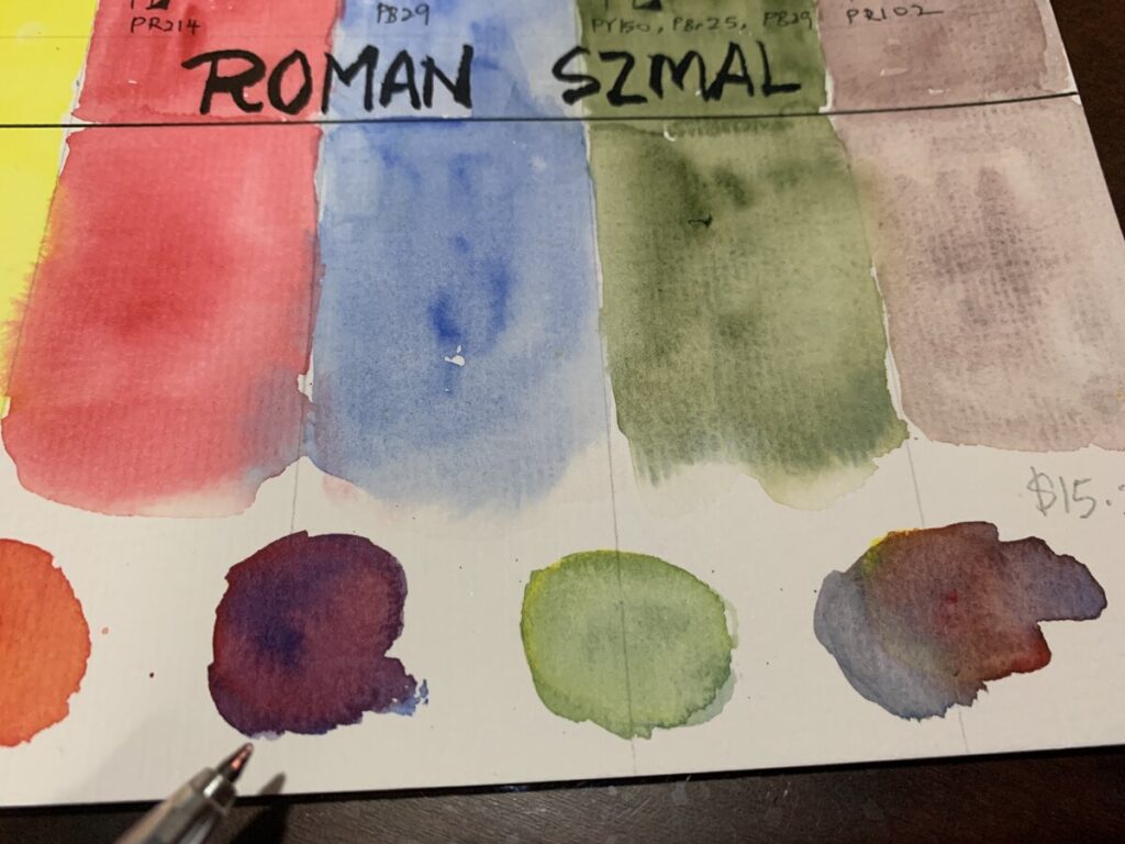
I have created the swatching chart to see their characteristics. I found some information from Jackson’s art webstore that Roman Szmal was made in Poland and all their paint are handfilled and they only produced a small batches each time for quality control. And yes, thei paints only available in full pan size. And they are offering artist grade and with an affordable price compare to colours like Schminke . Quite impressive. What interest me is that most of their watercolour comes in single pigment.

That are not many brands out there offering many pure pigments. The colours in this set are:

1) Lemon Yellow PY61 2) Aquarius Red PR214 3 Ultramarine Light PB29 4) Aquarius Green PY150 , PBr 25 , PB29 5) Caput Mortuum PR102. And here I am trying to mix the 3 primary colours to see how vibrant I can get for the secondary colours. Since Lemon yellow and Aquarius red are in single pigment, I would assume I can get a bright orange. And indeed, I did get a vibrant orange.

I love the grey that the 3 primary colours ( yellow, red and blue ) are mixed together and I can still see the separation of each colours.

For the purple, it may be quite tricky and depends on how much you mixed with the red and blue to get the vibrant purple . I can also get a light green easily by mixing the ultramarine blue light and the Lemon yellow. So far, the pigment are easy to rewet EXCEPT for this Caput Mortuum.I need to rewet quite a few time in order to activate the colour.

Colours that are granulating are, Ultramarine Light ,Aquarius Green and Caput Mortuum. Depends on your subject of painting, it may not necessary that you required granulating pigment in every painting.

Overall , I love this watercolour set as they are so easy to mix to get a bright secondary colour and great for beginner if they just started out to learn about watercolour mixing. At this point of posting, this set is sold at USD 15.20( excluding shipping ). But if you are buying other stuffs, the shipping cost may not be too significant and also depends on where you reside.

https://www.jacksonsart.com/roman-szmal-aquarius-watercolour-paint-full-pan-starter-set-of-5?___store=jacksonsart_en&acc=af21d0c97db2e27e13572cbf59eb343d

I have created a video on my swatching process and if you love my arrt channel, you may consider to like, comment, share and subscribe.

Posted in Watercolour | Tagged , , | Leave a comment

Forest Animals – Drawing Made Easy

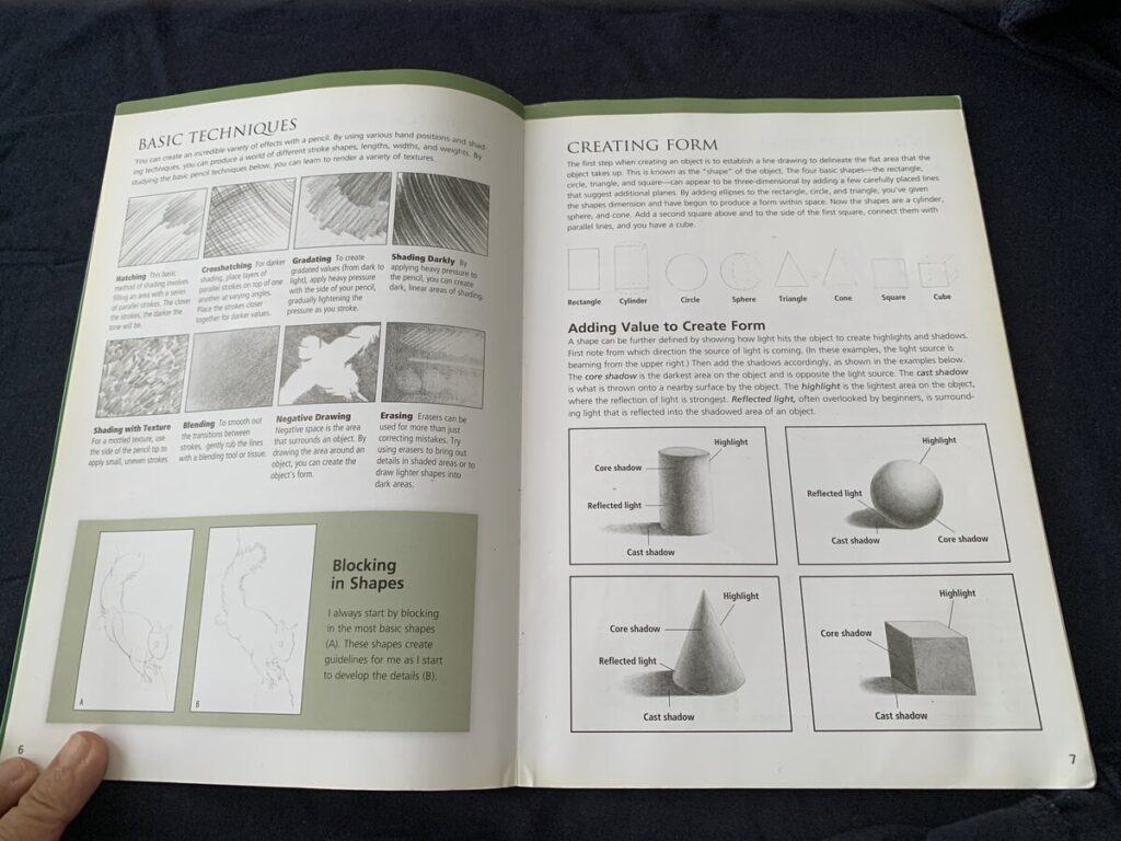
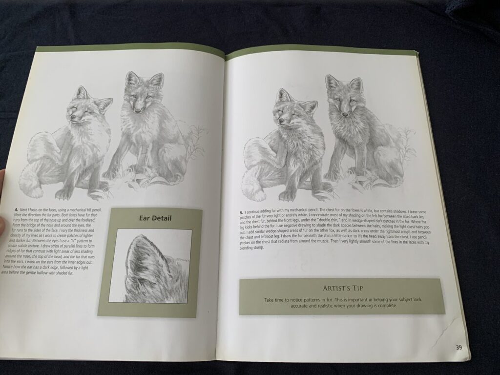
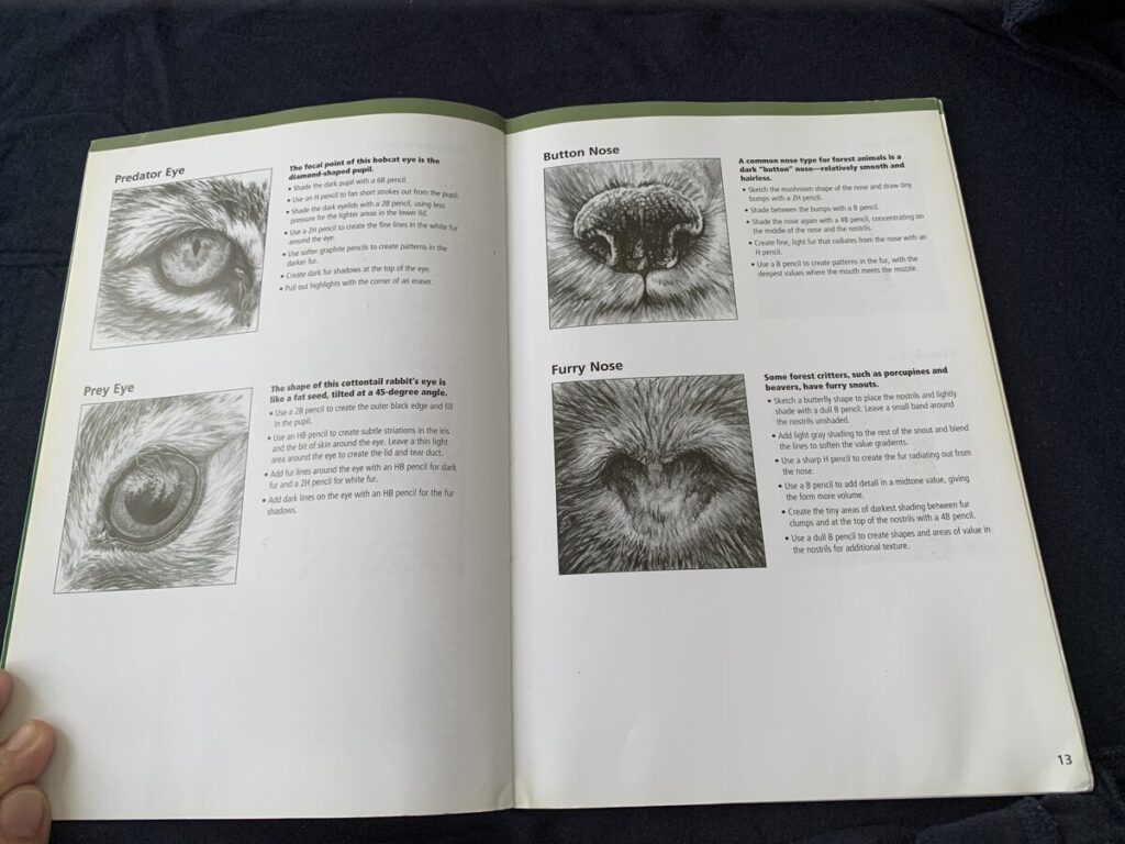
Forest Animal – Made drawing easy is a bite size drawing forest animal book which is easily to read through. However , It is more suitable if you have some basic background in drawing. Great content sharing about animal drawing. If you do not like to read thick books on how to draw and those dry shading process, this is a good resource with only 64 pages.I love how details of the each drawing using pencils. There are also real photo attached in order to show you how the drawing is done.

About the Author : Maury Asseng

Maury was an inspiring illustrator who featured many of his work mainly focusing on anatomical illustration and cartoons for medical textbooks. In 2010, his artwork was featured in the Upstream people gallery’s 7th Annual colour.

You may purchase the book on Amazon US as per below link. I earn some commission with the link and there is no additional cost from you. Thank you for your support on this blog

Forest Animals

Posted in Art Books | Tagged , , , | Leave a comment

Character Design From the Ground Up – Kevin Crossley

Character Design from the ground up is written by video game designer later came illustrator Kevin Crossley. A very well written book about hos background and solid sharing of the author sharing his hobby since young. This is a book about how to came out with design ideas, concepts and projects driven process.

I love how the author presents his thoughts and tips on sharing his characters design process. This also includes he is giving ample reasons the ample reasons of why keeping traditional sketch books are essential on the growth as an artist.

I feel this book is more suitable for intermediate to advance artist.

Posted in Art Books | Tagged , | Leave a comment

Let’s Paint A Market Scene

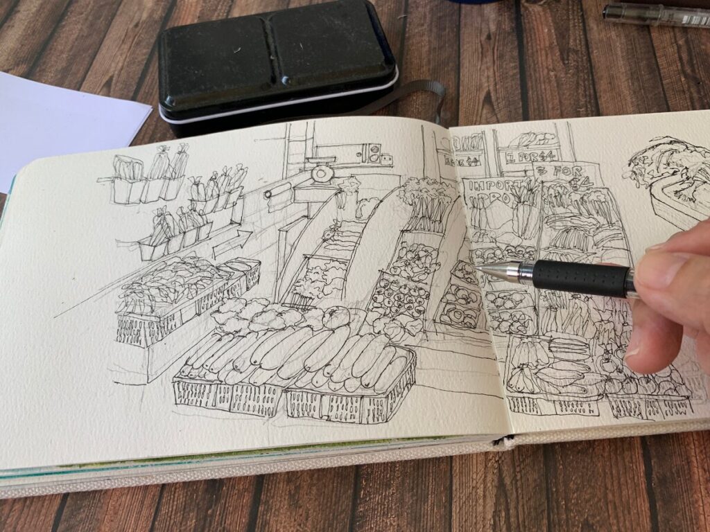
Today we are going to draw and paint something interesting that is a vegetable stall in one of the wet market in Singapore.This stall was owned by my brother’s friend and he sent me the photo which I find it such a good idea for my next sketch.

This is not the usual vegetable stall which only sell local products but some of them like the carrots , raw tomatoes , mushrooms are freshly flown in from different part of the continents which includes The Netherlands, Australia and Japan.

From the above sketch, as usual, I had drafted out the subjects using graphite and then using my favourite Uniball Signo 0.38 nib gel pen to pen down the final lines.

At the top right corner, I decided to spice it up a bit by zooming in more details of the imported products and sketch them out using the Uniball Air pen. I love the variants of line thickness that this versatile pen can create. But if you are a beginner, it may need some time to practice on controlling the pressure on holding the pen.

Since this is a vegetable stall, I will inevitably using more green colours than usual. I have used Some colours like Sap green from Daniel Smith and Shinhan professional watercolour paint. I have uploaded the painting video in my youtube channel and if you like, you may check it out below.

Posted in Watercolour | Tagged , , | Leave a comment