It ‘s been awhile I come back here for updates ! I was recently quite tight up with work and more active on other social media platforms. Sometimes, when you stop doing those routine things, you started to be more carefree or maybe abit laid back. I am back again and Im planning to put more of my art images here … for sale. I just wanted to push myself a little but more here .
Not too long ago , I have finished this Madame Web drawing in slightly the size of A4. When you put your drawing slightly bigger and putting in effort in filling the background , it is so complete, so satisfying.
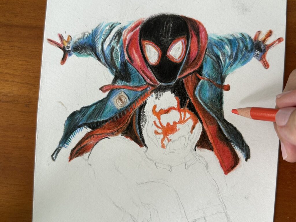
I love the comic feels in this one. This one was done on the Strathmore Bristol Vellum paper with the link as below. I am using 2 different photo references for this project. For the method I am doing here is to mix and match.Meaning , I am using the photo of Dakota Johnson which I like and then to put that onto another body of hers in Spiderman suit. However , I have miscalculated the size which end up I am just able to show a bit of the the spider’s legs portion.
If I have reduced the overall portrait size,I will be able to shown more of the back of the spider’s body. At this point I also wanted to mention about how good prima premier colored pencils are.When coming to coloring in red, the prima premier is definitely my main choice.
My recent drawing on Jennie black pink in colored pencils is maybe one of my favourite so far.I love the original photo reference which emphasize alot on the neon light , reflection on the skin tones. Photo reference is an important factor when comes to portrait drawing. And any significant casting shadow can really make a drawing pop. No matter how your skill set is , when you add some shadows to the drawing, it just make a difference. I am not that artist who can make that 100% likeness and my blending maybe not that fantastic.But what really matter was how I make some features stand out by putting some lighting. Example , forehead,nose bridge , cheeks area. And it all comes back to the fundamental of understanding where does the lighting comes from. I studied the photo reference carefully. This is a good exercise for me to push myself looking and identify where that shadows, mid tones , highlights are. This is so important , to make the drawing believable. NEVER ever try to imagine where that light source from your mind. Our brain sometimes works in a way to trick your eyes to think that that is correct.
I always love the brand caran d’ache luminance 6901 skin tones . I feel that the skin tones that they offered are the closest to the human skins. And I preferred the wide range of reds from the brand prisma premier artists colored pencils.
This is a relax drawing exercise which can really help in building up your eyes for colors, build up muscle memories and of course to have fun !
These are drawn from photo references, but what I am doing here is just to ignore the original color schemes from the photos and just focus on different colours to create values. This is fun as I don’t restraint myself to create depthness using different colors.
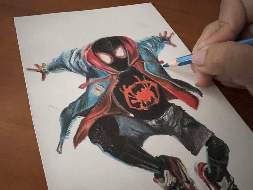
This is by far the only spiderman animation that doesn’t goes with the norm. I am excited when started to draft this spiderman verse and followed with the coloring process.This is not a big size that I am working on. The problem is when working on a smaller area for colored pencils ,it can be really tricky.
When the pencil lead was not sharp to a point,it started to get muddy and it can affect the accuracy of my work. Especially the eye areas which I think that some angles are off.It looked quite ” furry” and that is the reason of not sharpening enough.
Overall I think I get the job done. As for the final effect, I think I can do it much better if I am going to expand the area to A4 size .
Red Red Red .. I think by far this drawing of the Flash uses up almost all of my reds I can find in my color pencils empire. Layering and burnishing are both techniques I used throughout the whole drawing. The paper I am using is the strathmore 300 vellum series . I feel this paper is way much better than Canson XL illustrator which seems too smooth to work on.
Though this took me around 6 .5 hrs to finish. But I love the end result so much and definitely this will be my favourite of all super heroes of mine in 2023. Speaking of the reds that I am using, my favourite will be the prisma premier brand. The colors blended onto the strathmore 300 paper so smooth and the application is so much easy to use! It is all about the strength that you are applying .My focus on this drawing is definitely to bring out the shininess and lighting portion of the suit.If you noticed well enough, all super heroes ‘s suits are shiny and in those movies, special effects and lighting always an important parts make the heroes stand out among the crowds.
Below is my process in time lapse of the flash on my youtube channel. Don’t forget to give me a like and support by art by subscribed to my channel.
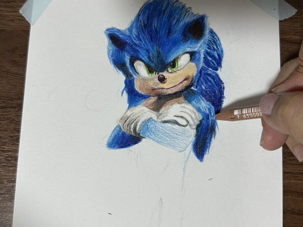
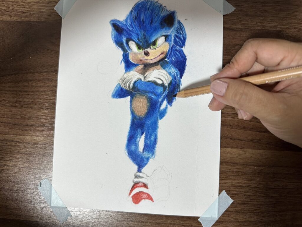
It is always fun to have collaboration with artist friends whom some of them I already know and it is a great chance to know new artists too. And to support my bestie artists friend is always I something I am looking forward.For this time round, since the collaboration theme is blue, I am thinking of doing something more straight forward considering the short time frame and it is also a chance to train how fast can I finished a drawing.
The adrenaline rush pushed me forward and at the same time it can be challenging as doing something big may not be favoured to the time frame. So I have decided to go with a A5 size with a slightly palm size down sonic the hedgehog can be a good idea.
The sonic hedgehog drawing served a chance to improve my blending skill too. For this kind of layering, it is always best to look and observe how bigger artists are doing. The result is not too bad 😅 . What I learnt from this layering style is always use a very light sky blue as base colors.And after numerous layering of different darker blues , the lightest blue just shine through. I don’t believe in just working with one brand alone as I love to see how each pigment from different blues compromised each others. I love the furs effect from the waist down.
The drawing is in my youtube channel as below link with the all the artists inks too. Don’t forget to hit the subscribe button for this sonic hedgehog 2 drawing.
I have always wanted to draw Keanu Reeves since after I got obsessed with his debut movie of “Speed” which made him the hearthrob in Hollywood. John Wick Chapter 4 I guess should be the final one ? Actually Im not a big fan of intense bloody killing type of movies,but I heard that this season got a really good reviews and I hope to watch this soon if possible. I also wanted to recap his agile action in the last John Wick 3 on Netflix soon.
I do not want to miss out any trend movie characters when come to drawing and hope this can help my channel to grow abit more😁 Ok , I got this style the inspiration from Drawholic . He did this back 2 years ago and it was really super amazing. By imitating his styles, it really help me to go into the mind of a great artist and to under study how he really break down the coloring process.
When I went into deep understanding of what are his blending skills , what colors he mixed for lighting and shadows was mind blowing. Drawholic always improvises his techniques . Before he started any drawing, he did uses some apps like photoshop to enhance the original photo references and he did emphasized on light effects alot. This effects can really double up the 3D effects and makes the drawing pops. Though, my techniques and skills maybe off in some parts, but to be curious in understanding my idol is just worth giving it a go.
The color pencils I am using is prisma premier / caran d’ache luminance 6901 and Faber Castell polychromos . They offered the best colors when comes to portraits and they are always my favourite among all
This is my fourth Greek Goddess painting. I am recently into this ancient beauties painting and had created a series on this. Artemis is a goddess about protection, chasicity . I feel she has a positive image even some believed that she is evil in some ways about environment.Nevertheless, I still wanted to paint her and forest is the theme for this watercolor painting. I am currently working alot on this Monjojo brand watercolor pad. This is one of the best student grade watercolor I have came across. I bought this for SGD 8 for a reasonable of 20pcs A4 size paper. This is cold pressed paper but this is the most whitest paper I came across as watercolor paper. Maybe in the near future I will write a review on this.
Unfortunately this is a local brand and there is nothing about overseas shipping .Otherwise, I will put the link down for my recommendation.
Watercolor is all about being patience. If working properly, it can gives a very delicate and subtle effect. Watercolor is great to work from a smaller to medium area. For all watercolor painting, I preferred to work on A4 size rather than A5 orA6. Watercolor is about working along the properties and the natural behaviour of the watercolor pigment.It is an unforgiven medium and we got to respect how it actually works, how the marks appear on the paper. Too much or too little water makes a great difference.
Watercolor is always my greatest fear. You will never know when you will get some ” surprises ” which sometimes can’t be fixed .It is all about the chemistry between the pigment and the paper itself. Sometimes an error is easy to fix, but sometimes if the pigment is staining enough, lifting up the paint with a wet brush don’t work.
I always put my trust in the process rather than the techniques that most artists adopt.Mainly because, I may not feel at that moment how much paint the artist is using with the ratio of water. And I may not be using the same paper as the artists use. The best way to learn about watercolor is to try it on my own with whatever art supplies I had.Coming back to the skin tones, It is always advisable to start with very light base. As you may observed, I always highlights the area along the brows, corner of the nose bridge,under eyes area. These are the areas which are the landmarks of the portraits. And I do make sure, I use wet on dry paper as this is to have the control as much as I can.
For details like eye areas, I will use my colored pencils for the little details. You can watch my full time lapse process on how I paint Goddess Athena. Thank you .
This is a drawing dedicated to people to boost up self esteem and self worth as an individual. Sometimes in life,we just somehow bumped into bullies , in schools, among circle of friends and in society. We DO NOT NEED their existence to make us WHOLE in life.Bullies come in 2 forms. Physical and silent bully.Physical bully is more straight forward which come in violence form with body contact.
Silent bully is a more complicated form which don’t necessary involved phyiscal contact.They don’t even have to raise targeted name but this can be a hidden bully which is meant for the targeted person to see and even intentionally spreading how the person behaved towards them. The next reaction from their friends will definitely be judgemental towards the victim.This is how they are gaining the power at the same time to hurt victim psychologically. Silent bully symptom may involved as below.
Using words( mocking, condemn, hates ,insults etc )
Images
hate videos
These are just some common techniques that they will use to spread it across the internet, social media and to friends and public.They will not fear of any outcomes but just to prove that they have the ” POWER” over something.
Be aware if you have such person around you. What you need to do is to report them. Let them continue to post , let them condemn , insult. They won’t run too far off. This really reflected their personality no matter how good their upbringing was. That is why, I always , ALWAYS emphasized the word ” RESPONSIBILITY ” on my youtube channel. They are a threat to society because their inner self centered characteristic is over powering them. They do not care how you think, they like to do what they want and just to thrash .This is a danger mindset as an individual to society.They can only rot to the core.
But always remember, you don’t have to surrender to any bullies. DRAW POWERFUL images to represent yourself .Tell yourself about your self worth.
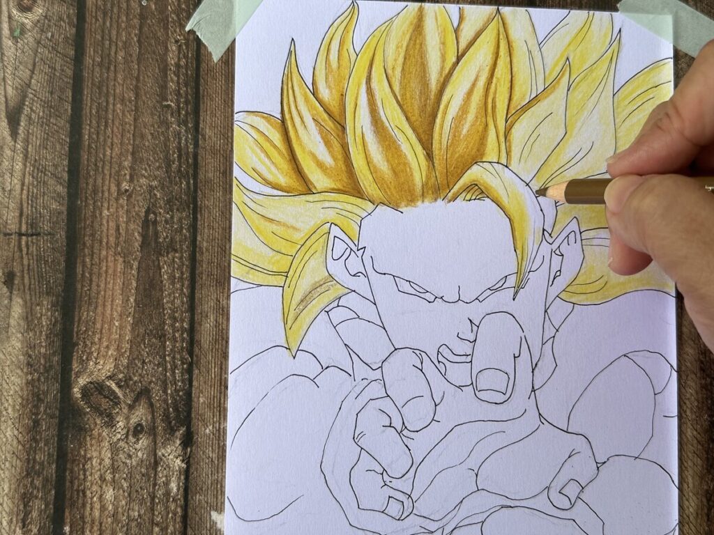
Coming back to the drawing of the dragonball Saiyan. I have used few yellows for layering. I really like the final result of the hair.For the outlines, I am using 0.1 MM permanent ink as I do not want harsh lines for this character.The colored pencils I am using is Fabel Castell Poychromos colored pencils.
Always take note of exaggerated various skin tones for anime. That is how they are differentiated from real portrait drawing. The link of the video is right below.
Hello everyone ! It’s been awhile since my last upload. Yeah, I was away due to busy schedule, with work and also to get my hands dirty on drawings and to focus on getting my youtube channel monetized.And I am excited to share the news that I did it on the last day of Dec 2022!What a Journey! This is definitely not an easy one without friends supporting me globally. Thank you to their greatest support !
Today, I will be sharing my latest youtube video on drawing Super Mario Movie .This is a fun one with lots of vibrant colors to work with !
I have bought some blues sometime back while I was doing some art supplies shopping. I always thought how cool to have the caran d’ache luminance 6901 middle cobalt blue 660 which is a very common blue that drawholic use in many of the cartoon drawing.Then I decided to add on some more range of blues in case I needed them in the future drawings. All the colors are great except for Derwent Pro color which I am not sure why the pigment just glided on the surface of the paper and not fully blend onto the tooth of the paper.
Of course there are still a good selection of blues and reds from the prisma premier colored pencil series. Who don’t love this creamy pigmented colored pencils. For this Super Mario drawing, I have included some really great student grade Faber Castell Classic green. They are by far one of the best affordable student grade colored pencils in the market.
Below is the drawing video and if you like this, please help to support my channel by subscribe for future art video and give it a thumbs up .Thank you !
This is the animation movie Puss in Boots , The last wish that I am looking forward to. It will be premiered in Singapore before Christmas, so exciting. That is the reason I feel it is just right for me to draw this before it will be shown in Cinema Globally.
This is not a difficult drawing but the tricky part maybe the furs that will normally make me caught up with. For such iconic animation cat, I will look up for the landmark which is it’s cheeky look and to put that all into to make it more realistic.
For this drawing, I am using mostly prisma colored pencils and I guess that is the best choice so far.
Below is the end result. Frankly speaking, I really love the rustic silver sword looks and I did made some changes on the glowing colors on Puss in Boots . It looks brighter compare to the original poster. Below is the youtube link for this speed drawing and hope you guys like it.
This was drawn 1 week ago using kraft paper sketchbook.I feel kraft paper is something that will help beginner portrait artists alot. And it really help to speed up the coloring process.This is the hahnemuhle brand A5 size sketcbook.I bought it from my local art store . I can’t remember the price but I don’t think it was that expensive. It was fun to use on drawing portrait as the paper can act as the base color as skin tone.
This is quite a quick drawing and coloring as this is not a full colored pencil sketch.This paper is 120 GSM and I have done numerous highlighting and erasing and the paper seems able to withstand some rubbing and tearing.
Below is the time lapse coloring process on Jennie fro blackpink I have done on my youtube channel. Do remember to subscribe if you have not done so.Thank you for you support
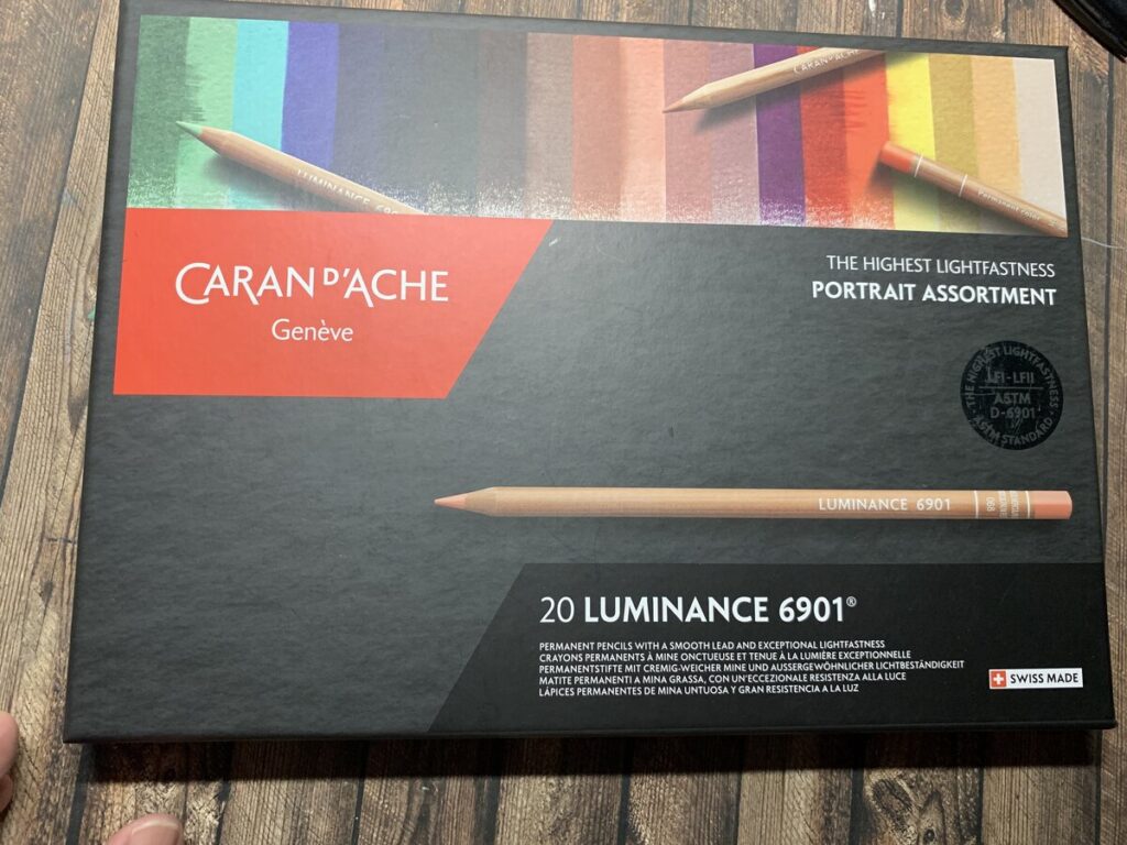
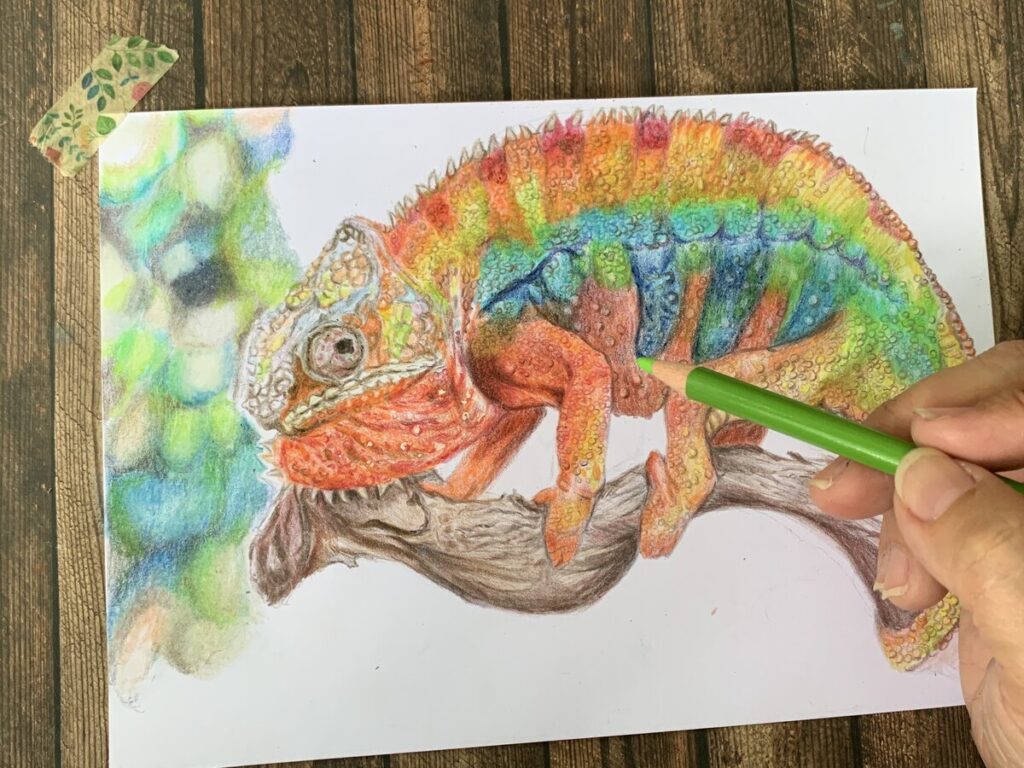
This is something that I find that it is fun which I am trying to play with rainbow colors on my drawings.So I have decided to try this chameleon drawing and coloring. The purpose of this rainbow theme is also that I am trying out the caran d’ache portrait assortment set which I have bought from Jackson’s art store recently.
This is my first go to online art store whenever I am trying to purchase some new art resources.They may not be the cheapest sometimes, but you definitely need to check out some weekly sales which they will put up on their website. In the future post , I will share more about swatching and my first impression on this portrait assortment luminance 6901 set. Fantastic.
I think many colored pencil portrait artist will be very familiar with Caran d’ ache luminance 6901 set. Below some of the photos taken during different stages on how I tackled using my method on layering.
The colors on the chameleon are really easy to work on and extremely vibrant.
Some of the tips I can share here is try to layer them step by step. Always starts with using very light pressure and slowly and gradually working on your strengths. But I find that, if there is any mistakes, they can be easily removed just using any normal eraser.
As Chameleon skins are covered with scales and some little lumps, I am trying to put all these details onto the the drawing. Though , It may take up lots of time, but it can be fun if you like to draw details.
The coloring process can be found on my youtube channel. I have break up the coloring into 2 different videos.One is just the chameleon and then further on the 2nd video will be how I create blurry background. Hope you guys like it.Thank you for supporting my channel 🙂
Below is the purchase link if you are interested in the caran d’ache luminance 6901 20 sets ( portrait assortment) as well as the canson bristol illustration papers which I normally work on.
This is one of the most challenging drawing that I have ever done for artist collaboration. It was fun making art during this period as I am always looking forward to with my fellow artist friends. This time, we make it more fun by drawing lots and then to swap the art style with the artist that was chosen. For me , I have swapped with one of my artist friend which she has chosen her past art , that was a turkey and I was suppose to recreate it with own style.
It may looks easy at first, but when you really sit down and try to study the features of turkey bird, you started to panic looking at the details, from the eye , wattle to feathers and you know that this is not going to be easy. And the best part was, which colors to use? which were the base colors and the patterns of the feathers were just too overwhelming.
I am using mostly prisma colors for this as they offered the wider range of choices compare to my faber castell polychromos . I am not sure if this is due to the nature of the pigment, they seems to fade away quite easily and I have to keep re layering the colors to make them brighter.
I love the overall result especially the patterns of feathers . This whole drawing and coloring took me around 9.5hours .You may watch my full process in time lapse in the link below.Hope you guys like it.
In last week video, I have decided to try watercolor as the request came from my friend.
For this painting, I decided to give her a delicate feel and not working too dark as in the past.For watercolor, it is always advisable to work from thin layer to dark due to the properties of the pigments. In this portrait painting, I was using the mission gold permanent red.In order to create that delicate skin tone, I have mixed more water to the permanent red than usual.Speaking of the watercolor sketchbook I am using here, it is the Kuelox 300 GSM cotton paper( 130 mm x 190 mm ).This is an affordable watercolor sketchbook and the quality is fantastic! In the future, I will be doing more reviews on this sketchbook.
After the 1st layer, I started my 2nd layer focusing more on the shadow area as well as the eye brows. The technique here is quite straight forward, that is just use lesser water and abit more pigment. You can also just repeat my earlier stage by just layered thin permanent red over the 1st layer. The trick still ,is not to overwork , but just layering slowly. Using this 300 GSM is beneficial especially for beginner artists. You don’t have to worry too much on tearing the paper or causing wobbling of the paper due to too many layers of water.
When comes to details, I always used colored pencils as they are way much easier to control than just a watercolor brush. Below is the purchase link for Mission gold 9 set. This is my 1st set of artist grade watercolor since I used 3yrs ago. I have also attached my video link for this process .Hope you guys love and remembered to subscribe to my channel for more future videos.
This is a fun drawing again with Anime Vs Portrait Style.This time,I have decided to choose 2 well known characters and put them together.
I am using a black 0.1 mm pen in this Tuxedo Mask drawing on the left side.And then work with the rest of the details using colored pencils. Black colored hair was a challenge as you need to be careful in slowly layering the black with grey and black. If just using a black alone , it may turned out flat.
I love to draw more portrait and always feel it is much more challenging than anime. Anime character’s line works are more straightforward while portrait you really need to drill down in looking at the proportion and more detailings are required in terms of skill level.
Next came the drawing of BTS Kim. Overall , I feel his eyes and eyebrows are the most difficult part to tackle.
The color pencils that I am using consist of various brands like, prisma, polychromos and carand’ache. If you like this, you can watch my time lapse video on youtube with the link below.
Recently I have completed this drawing of Eleven from this top series Stranger Things 4 from Netflix. What I know that it has caused such a wave that many artists started to draw different characters from this hit series. This is definitely a trend in the portrait community.
For this drawing I did not following exactly the skin tones from the reference photo. I am using a bit of Chris Hong’s colouring techniques here and I am looking forward to see how it turns out.
For realism drawing, I have to draft out the full details carefully in order to achieve at least 80%of likeness. I agreed, sometimes I have missed some important landmarks which make the final drawing slightly off.
I feel the overall effects were a bit too delicate ?I can definitely see the delicate skin tones through the paper .I think I am quite satisfied the overall feels of delicacy and I feel that it somehow bring out my styles of how I stylized this portrait. This is not easy always easy for me and sometimes I have difficulty in telling the exact colors or what colors should I be using.
I believe this will comes with more practices and to train my eyes to learn how to decipher the color codes. I am someone who don’t believe in using the same brand throughout my coloring process. I love to see how different brands of colored pigments react together when I mixed them. For this drawing, I have mixed with prismacolors, polychromos and caran d’ache luminance. Fantastic ! I love to make this kind of drawing in near future.
I hope you can support me by subscribe to my channel so that I can make more videos just for you guys. I hope you enjoy this drawing as much as I love making it.
This was the 2nd series of Anime Vs Realistic portrait that I am working on it few weeks ago. Sometimes I get idea from Instagram on this kind of drawing. It was fun though to visualize the final result. This time round, I have decided to draw Sailor Saturn in anime and then transform her to realism.
Actually , I have no idea Sailor Saturn does exist. All the while , I only thought Sailor Moon was only the blond hair girl with a magic wand with sailor suit. Obviously , I was wrong.
For this kind of merging drawing, sometimes it is up to you to decide which side should be the anime drawing and vice versa. For them to merge well together, I have to lay them in pencil draft so that they are about in the same position. But I have to highlight that , due to different style of characters, they may not be in proportion. It is always unrealistic in anime compared to realistic drawings. The eyes always appears twice as big as realistic person and the lips are mostly represented by thin lines only.
Overall, it is always challenging to draw a realistic portrait then anime or cartoon styles as their lines are way not as complicated as portrait. It took me quite awhile to get that eyes, lips nose correct for the portrait drawing.
I feel that I can do it better by shifting the anime just an inch down to make it at least aligned with the realistic side. The drawings are completed. Below is the link to my youtube channel.Thanks for your support always.
This was an artists collaboration a week ago about drawing our childhood memories. This is interesting at the time challenging as sometimes drawing children and adults are quite different in proportion. And most of our memories are so far away and most of us couldn’t even remember much, unless you have old photos to help in your drawings.
For myself , I have some vivid memories but I don’t have photo to support on my drawings.So this is quite tricky for me. Since I am into portrait drawing ,I need to find a photo reference that can help me to “speak” about my memories to my audience .
So this is where I started to plan on putting more of my concept here. I planned to give it a more dreamy look for this drawing .Previously, I have collected many photo references in case( even if I am not drawing that reference ) I needed to use that one day. So here it is.And I wanted to put my family inside but not distracting the whole focus of the portrait . The idea is to kill 2 birds with 1 stone in this and I feel quite satisfied with the final concept.
The material use here is basically canson illustration bristol paper ( smooth ) and polychromos colored pencils and some caran d’ache luminance colored pencils
The video on this collaboration can be found on my channel . All artists channels can be found in my video descriptions.Thanks for your support to them and to this channel.
Recently I have put up a post on my instagram page about ” I will be drawing your photo reference “. I thought this will be fun as it will be your photo reference that I will be drawing and coloring.There were a few requests and the photos my friends submitted were great for me to practice.
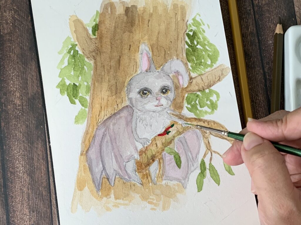
This week I am drawing my friend Creative Art who has submitted his photo reference. It was fun as it was a combination of a Bat and Rabbit. How cool is that !
Of course, this will be a challenge for me as my focus is more on drawing human portrait.but definitely this maybe something I will be working on on my current youtube channel.
For this, I did not follow exactly as the photo reference and I wanted to throw in a brighter background. So this is what I did as below.
After a while, I feel that it looks slightly more towards feminine side 😆 Anyways… I will take note in future . At first I wanted to make this a inking drawing, but it turned out not that good and I didn’t really like it. Watercolor process is also faster working on this small piece of artwork. By the way , I am using the baohong academy ring A5 size notebook watercolor ( hotpress ) and 100% cotton. This is a cheaper range compare to other 100% cotton sketchbook. The bao hong academy ( student grade ) watercolor pad had caused a big rave over in the art community in the past. For this black watercolor sketchbook , it was the first time I came across and I bought both hotpress and coldpress on Lazada . I will review about this sketchbook once I made more paintings on it.
The watercolor I am using on this painting is the Schmincke Horadam 12 sets watercolors.
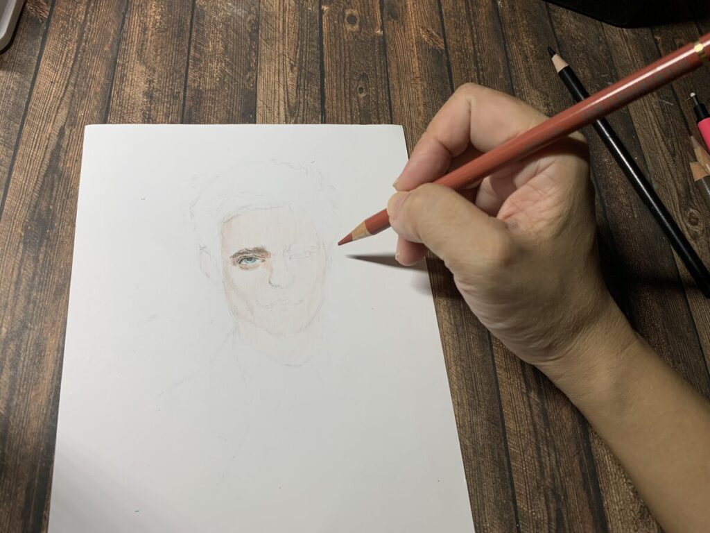
I am not sure where I get the inspiration from to draw Robert Pattinson.Anyways, it has been awhile since my last realism drawing.So this week, I decided to drill my skill again. This is really important when you want to practice and hone your portrait drawing skills.
This drawing seems to be abit rush over last weekend and I have decided to film it partially at night to rush this drawing on youtube. As I am working full time on all weekdays, so time management is very critical for me.
As usual, I did alot of studies on the reference photo and then to mark them on the canson illustration bristol paper. I love to use this paper as it is very white which help to brighten up the colors.They are so smooth which can help alot on layering.
I did some adjustment along the way in order to get that precision to the reference . This is so important in order to capture the likeness. I have created my own style with the final result which doesn’t look too bad. For skin tones, I am using a mixture of Faber Castell polychromos colored pencils and caran’dache Luminance . I love caran’dache as their skin tone is really perfect and great on canson illustration bristol paper.
How do you like it ? You may leave the comments below . Video is up and you can watch this time lapse on my channel.Thank you!
This week video I have combined again my portrait with another scenery painting. The last one was the collaboration with my artist friend which I have drawn portrait with mountain. And I thought that was a cool idea overall. For this painting, I have decided to try a new art supply which is the winsor and newton artist grade gouache. I can’t comment them too much as I am yet to try out the whole colors.
But when I bought this on amazon, I had a really really good deal during checkoutI bought it at SGD 14 with shipping inclusive for 10 tubes ! If you going to buy during normal sales , it costs around SGD 40 and you are been charged for shipping fee
The green effect wasn’t that satisfactory and it seems bit too bright for viewers. What I did was to tone down the green to make it muddy by adding some brown to the green. I should have added more of white as well . For the skin tone, I am using mixture of yellow and red using Mijello Mission Gold watercolor. I have added a decent amount of them to add as base skin tone.
For the rest of the facial and highlight, I am using polychromos colored pencils .
My full video is the link below if you like to follow me. Thanks
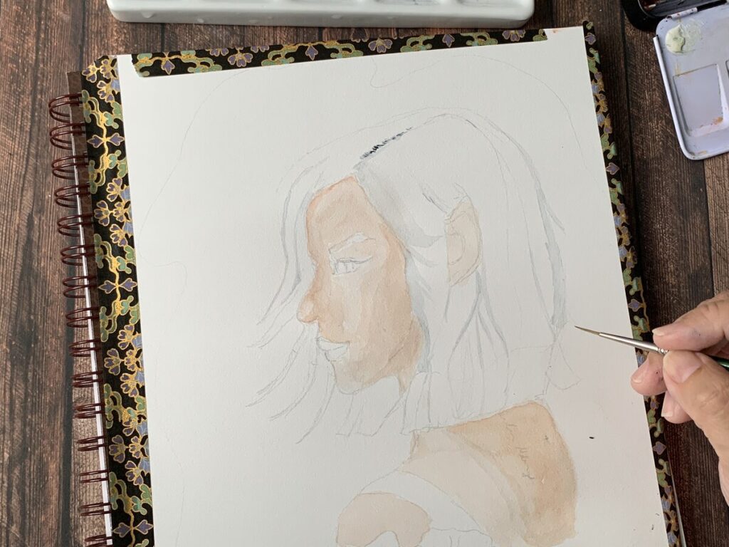
This is a fun and difficult subject to draw when comes to Fantasy.I am excited as this was a friendship collaboration with some of my youtube friends. It is always challenging for me when comes to use watercolor in my arts. First, it is quite hard to use watercolor on portrait as I love precision and details on my drawing. So for this drawing , I decided to use watercolors on skin tones, background , elements. But when comes to eye details I have decided to go with colored pencils.
Another reason for using watercolor on this piece was they are quicker application compared to colored pencils rendering/ layering. And also because I was I late for for this important collaboration.
Talking about reference . I am using the reference from pinterest and I did quite abit of changes on the original reference. I changed the hair colors , ears , lips and not using alot of shadow in this. Why ? I feel fantasy portraits should be more spiritual when I am approaching this drawing and I just wanted to show more details on her face.
At last min , I made some stupid mistakes which required me to re paint this drawing again 🙁
The material I used on this painting are listed below:
1)Mijello ( Mission Gold Watercolors)
2) Shinhan PWC Indigo for the background
3) Strathmore Visual Journal Sketch Book
4) Polychromos Colored Pencils
Below is the video for the collaboration. Please support me if you like my art by clicking subscribed button and notification bell for future vidoes. Thank you
This is the Pixar and Walt Disney movie that I am looking forward to in year 2022.This is more told story about how Buzz lightyear become from test pilot to space ranger. Today, I am focused on my coloring process. Oh yes, I will always remembered this as the process is a killing me softly and cruelly 🙁
I think I have spent too much time in contouring lightyear’s face till I was burnt out in the middle…. after this experience and lesson learnt, it is always advisable not to over think and just trust the process. Keeping the momentum is soooo important when comes to creating art.
But before the process, it is always good to self analyze if this is something for me ? I just take the plunge in and thinking it should be easier than portrait drawings. Anyway, this is just animated ….. but things took some wrong turns when I started to realise , the time spent on twitching and making indecisive decision on and off ,kills my momentum.
When panic kicked in,I realised that I had to rush my work till evening which you may noticed that there was some bad lighting in my video …. It is always a bad idea to record at night …
My mind was drained after finished the hair and the face portion.I had to keep on reminding myself to look out for clarity of colors , layering etc.
My 48 sets polychromos colored pencils had some limited choices of green which I have to find the closer one and together with different colors to get that somehow acceptable color tones. The overall coloring process took me estimated 4 hrs …
Below is my youtube link to my channel ” mom who sketch ” which I shared my process. Thank you for watching
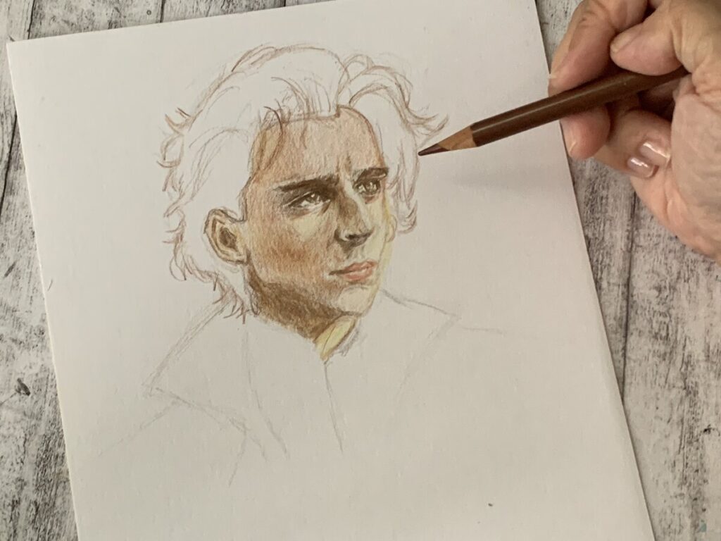
This week I have decided to push this video out about Harry Potter coloring process. I have not being uploading videos for close to 3 weeks due to I was down with covid. I have this Harry Potter video in mind as there is a movie on Harry Potter 20th Anniversary : Return to Hogwarts featured on HBO. I guess Harry Potter’s fans should be excited over this regathering of the casts.
I am drawing a younger version of Harry Potter for this video. I like my pencil draft and I have drew this in a smaller scale this time around 14x 16 cm. As I just recovered, I just wanted to do something which is easier to manage for me. I am using caran’d arche skin tone colors for the base and the rest with polychromos and some selection of Holbein Artist colored pencils
I am using 3 skin tones for Caran d’arche Luminance 6901 which are as below
Burnt Orchre 10% , dark flesh 40% and burnt sienna 10% . They are so expensive to own and I don’t use most of the colors except skin tones. I love love LOVE their skin tones and may add on some more skin tones in near future.
I am having a tough time layering Harry’s hair . I hope I can do them much better . Oh yes, I did use Holbein Artist Grade colored pencils ( Indigo , gold ) on Harry’s clothing. They are really pigmented and much richer than polychromos colored pencils in my view.You can catch my video which I decided to slow the speed so that you can watch my process. Thank you
This was my first drawing in year 2022. For this coloring process, I wanted to keep it simple by using limited colors. Below are my chosen colors for this exercise.
Faber Castell Polychromo – Raw Umber, Black , Beige Red, Krapplack Madder
Caran d’ache Luminance – Burnt Sienna 10%
After trying the colors and if you are ambitious enough, 4 colors should be enough. This will be 1 skin tone, 1 shadow highlight , 1 black( hair ) and 1 red( lips ). I find this exercise is great for beginner. Reason is simple. It is always intimidating to try out different colors and in the end causing too much confusion. By limiting the number of colors , you will force yourself to work around the colors and you will improve over time by training the eyes to use colors creatively.
The eyes are always the most challenging part and though I wanted to follow as close as to the reference, but I wanted to put in some of my ideas by not copying exactly the same. Other than those superhero and celebrity portraits which I have done so far and I have to follow closely on the details, I hope for other portraits , I hope I can throw in some of my styles in. Speaking of this, there is one youtuber artist , Chris Hong, of whom I really like her style so much.
I have attended her skillshare course where she shared her own views about creating portraits.Yes, we all love to draw exactly as how the photo reference turn out. But what is the whole meaning behind of arts where we just copy exactly the same ?
I believe that we need to appreciate our own arts no matter how they turn out. I love my drawings even they don’t turn out 100% alike. They are still my arts , my babies.
The video can be found on my youtube channel as below. By the way, my channel is ” mom who sketch”. If you like the video, you can support my channel by clicking the subscribe button and remember to hit the bell ( in grey ) so that you can be notify of future videos. Thank you so much.
This is my last drawing and coloring in year 2021 . I love this Spiderman No Way Home movie and I wanted to draw this even before the movie was out. I always thought it was much easier to draw Spiderman since he has no expression . I was quite wrong as I still need to consider other areas like the body posture, layering of colors, the overall body proportion.
I started off with outlining the eye and the web design ( I don’t know how to name it 🙂 on the face mask of spiderman.
I could not find that perfect red for the spiderman suit. So I have chosen the brightest red I have. I have made some mistake while during coloring as I put in too much pressure instead of layering gradually. Hmmmm….. For the indigo portion, I started to layer it more careful as I wanted to show the light reflection on the Spiderman suit.
It is always a torture when comes to color superhero suits. Too much details to be taken care of. For this suit, I try to color them in small portion at a time.
For this coloring, I am using Holbein artist grade and Polychromos colored pencils. The Video can be found on my channel. Thank you for your support 🙂
This was an global collaboration for my other 10 artists friends over on on youtube on 18 Dec. Below are their links .
1.ArtistaRuchi(GMT+8)2pm – https://youtube.com/c/artistaruchi 2.Najzla Art (GMT+8)2:54pm – https://youtube.com/c/NajzlaArt 3.Yeth Art(GMT+8)3:30pm – https://youtube.com/c/YethArt 4.The Rising of Ronin Bonsai(GMT+8)3:48pm – https://youtube.com/channel/UChnIIEIGmoLjrHp0hSvAL5A 5.Nina Art life (GMT+8)4:15pm – https://youtube.com/channel/UCzonSJfCtMVuvhqb7mdxNpg 6.Gene Joy Art (GMT+8)4:42pm – https://youtube.com/channel/UCeQnB-2m9QcG9hAoTEPUGgg 7.Arts with Gie (GMT+8)5:09pm – https://youtube.com/c/Artsw%C4%B1thG%C4%B1e 8.MdrawingM (GMT+8)5:36pm – https://youtube.com/c/MdrawingM 9.Vanessa Art Vlog (GMT+8)9pm – https://youtube.com/c/VanessaArtVlog
For myself, I decided to try and draw fairy theme for this collab using mixture of medium ( pen and ink , colored pencils and watercolors ). Lots of planning on the christmas elements and flowers to be included in this drawing. For the face of the fairy, I found a model on pinterest and then modify abit on her facial features and also include the ornament on her hair . This was a mix and match drawing .
Maybe I was too nervous, I almost forgot about the fairy’s wings and added at last min. I thought the background was a bit plain and decided also to throw in some watercolor background. But, I also need to be cautious not to make the background too dark which may distract the main focus ,the fairy. I was quite satisfied with the overall composition.
You may check out my coloring process on my YT channel as below link. Thank you.
This is my first time trying out Canson XL Bristol Illustration paper which I bought it from my local art store. This was such a hot item that I grabbed the last pad on the shelf.
I love this paper as it is white. I don’t fancy working on off white paper as sometimes it may dull down the colors. The paper is matt finish and still have some slippery feel .This is my first time using polychromos colors on this paper. But seems polychromos are oil based colored pencils, I feel the pigment just glide onto the surface of the paper .. hmmm.
Anyway, below is my coloring process for this week video 😛 I love powerful reference photowhich shows strong shadows , the features or landmarks on the face. It really helps me alot during the drawing as it really makes the drawing/ sketch pops.
I am so excited till I hit a problem right away during coloring using black against yellow.I never thought about this issue . When you are doing coloring ( whether colored pencils or watercolor )using black against any colors, the black will definitely be a dominant color because,you cannot overlay yellow onto black due to its property. The yellow that I am using is not opaque at all and I don’t own any posca markers.
So I decided to draw thicker yellow lines first then slowly and carefully using black around the thick yellow lines. This way , if I feel the yellow lines are too thick, I can still use the black to cover up some yellow lines to make it softer and delicate. I hope you get what I means 😅
For this drawing, I am using just 3 colors which are black , yellow and orange ( for details ).
Below are my affiliate links with Jackson Arts. This is my trusted art supply store which I bought my art supply from. If you buy through my link, I earn some commission for me to run this art website . The cost will not be added to your purchase during check out.Thank you for your support
1)Canson XL Bristol Paper https://www.jacksonsart.com/canson-xl-bristol-glued-pad-180gsm-50-sheets-a4?___store=jacksonsart_en&acc=af21d0c97db2e27e13572cbf59eb343d 2) Faber Castell Polychromos https://www.jacksonsart.com/faber-castell-polychromos-pencils-set-of-36-in-a-metal-tin?___store=jacksonsart_en&acc=af21d0c97db2e27e13572cbf59eb343d
This is the link to my video and I hope you enjoy this .
Today, I am trying out a new sketch book which is the kraft paper. I bought this from a local art store . I wanted to try other medium than just bristol alone. When working with kraft paper, one good thing is the brown paper can act as skin tone when comes to portrait drawing.That is the charisma of this type of paper.
When come to drawing, I am applying some loomis method to get the idea of the placement of the eyes , nose and lips. Sometimes, it is just sooooo hard to get the sweetness of the character. Before this, I have tried to draw Lisa before but I give up , just because lacking the sweetness of her face.
But I realise one thing, I totally forgot about leaving some brown tone of her skin using the paper. Damn it.
I am eager to try more of portrait drawing using kraft paper. After this first drawing, I feel this Hahnemuhle kraft paper is very forgiving as I have done some corrections using kneaded eraser. I am really afraid that at some point , the paper fibre may give way. But I am lucky that this is not happening.
Material use :
kraft sketchbook – A5-size (14.8cm x 21cm) or A5 size · 80 sheets or 160 pages
I feel drawing and coloring marvel characters can be so challenging . There are so many things to consider , likeness, clothing ( one of the most difficult subject for superheroes theme ). So many blending technique to know about. Frankly speaking, this coloring video is such a scary moment for me ..
As mentioned in my video, this request was came from a close fren who is a close soul to me .She is not an artist by the way, so there is no videos on her channel :). But she is always so encouraging when I hit into any obstacles in my life , including my drawing journey. A big thanks and hugs to her.
The paper that I used was strathmore bristol smooth . And paper was 22 x 22 cm . I love square size for bigger drawings that allowed more spacing.
Today , I would like to share about my process in coloring Timonthee ( Dune Movie ). First , I would like to talk about using photo reference. Normally when I go through pinterest, I will look for photos that have strong cast of shadows.I feel that photo with significant amount of sunlight will create dimension and impact to the photo. It will make the photo looks more 3 D.
In the original photo, there is sunlight casting shadow on one side and it created a tint shine of yellow onto the skin. Therefore , I am using cream yellow as base color onto the face. Then I added some Burnt Orche onto the 2nd layer and some shades of walnut brown on the side bridge of the nose.
I am using burnt sienna on the outline and onto the hair , but I feel , Timothee’s hair is more towards walnut brown ….. hmmm. I don’t have a particular rule when comes to coloring, but I try to follow closely with the photo reference .
Material use:
Strathmore Bristol Smooth and Faber Castell Polychromos Colored Pencils
Below is my time lapse video on the coloring process, if you like it, don’t forget to like, comments , share and subscribe to my channel. Thanks
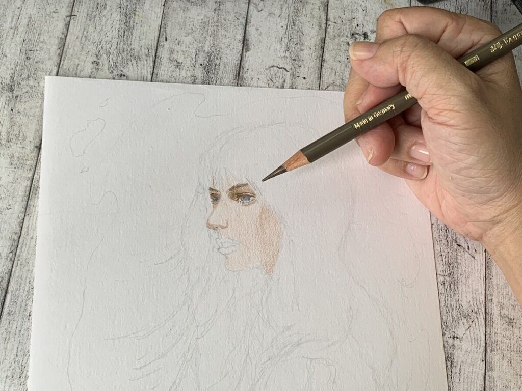
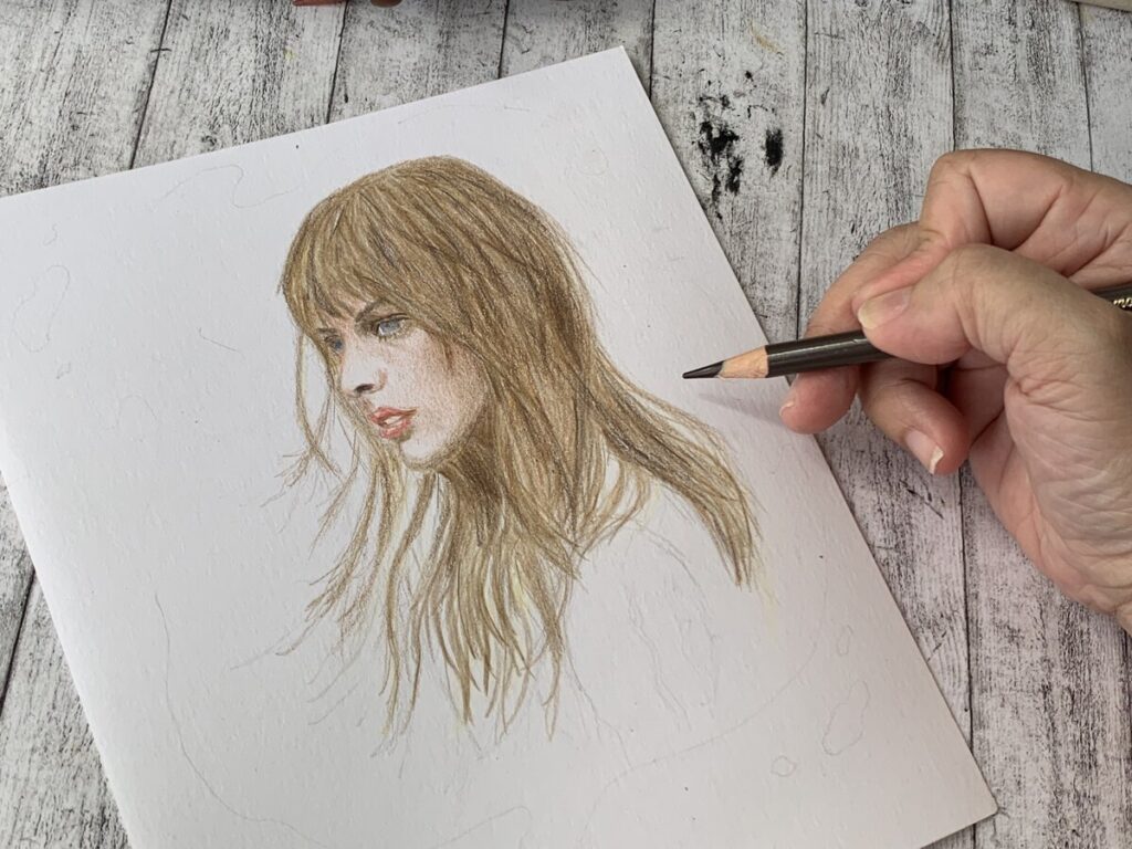
This is not the popular image of Taylor Swift that I am trying to draw . I love images that tell a story,not necessary be the typical front view of the portrait when trying to search for a reference. I am a pisces and I depends alot on my feel and emotion when come to draw.
This reference was somewhere back then when Taylor Swift sang this ” The Hunger Game” soundtrack ” Safe and Sound”. By the way, it was 10 years ago and you can imagine how young Taylor Swift was back then. Have you watch this music video ? This was quite touching.
Coming back to the drawing, I love the side view of her where she was looking far out to the open field area. I am trying to throw a background on this drawing as it looks quite plain. So I was thinking of throwing a dark background .
Material use on this drawing is Strathmore Bristol Smooth Paper , Faber Castell Polychromos colored pencils. I am using Indigo Blue , Shinhan watercolor for the background .
I don’t know how long this challenge going to end 😛 , maybe I am going to do this a little while.
I am always particular when comes to choosing the right photo reference for every mini project that I am uploading onto my youtube channel. This photo reference always stays on my mobile phone and I wanted to do the drawing one day and here it is.
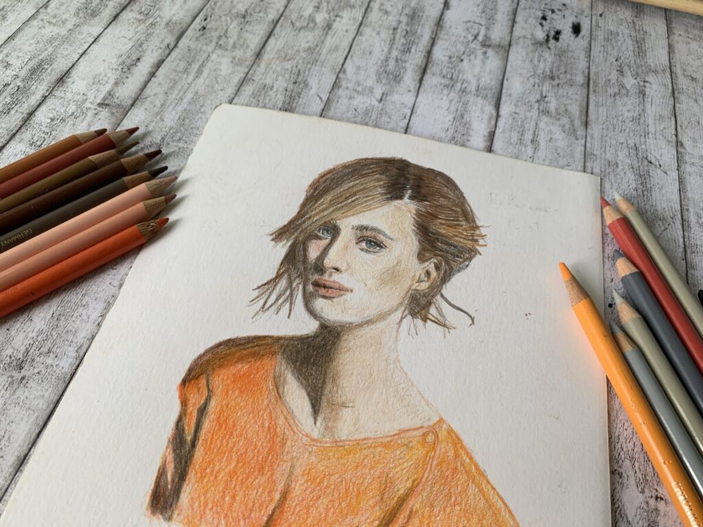
Actually, I am quite satisfied with the overall face effect that I want to convey in my art. She was quite subtle and delicate. Facial expression is one of the most difficult subject in my portrait studies.But but…. I have issue with drawing arms and hands . I feel they look abit too skinny.
Whatever …. I always planned them in my little sketchbook before a video was made. I get questioned about how I drew portrait. I don’t have better advice as I am not a professional artist. But I do them in my own way that is I studied them really and REALLY close each time when I am holding the photo in my hand.
I don’t know if I interpret my drawing correctly as I find it abit soft and sweet for this drawing .That is why, I have decided to add in my own elements , the boxing gloves. I love telling a story in a portrait. I will do this more often in my future videos
No,I am not doing the whole 31 days of Inktober. It will kill passion if I am going to glue to my chair for some intensive drawings.
I have done day 13 before and you may check out my youtube link. Anyway, this is just for fun and nothing too serious.I am drawing this on Canson Aquarella paper for this mini project.
I decided to try out brush pen with some ink .Actually , I quite like about the unique strokes created by brush pen. The one that I am using for this drawing is Pentel Brush Sign Pen Artist.
This is a NON FADE/WATERPROOF brush pen and definitely not suited if you want to work with other water based medium like watercolor/Gouache etc.
OK, I admit I am kind of breathless while looking at the photo reference and draw it at the same time. So far, It never happens to me when drawing any female portrait . Back to the sketching process. This is by far one of the more challenging portrait other than Gal Gadot. I have done it twice just because I could not get the expression and proportion correct.Damn it.
The facial expression is killing me , with multiple corrections in place. Then came the hairstyle portion. Another challenge… I have short attention span and when comes to hair or clothing, I always just brush it through. Since there is some back light at the back of the model,I am using burnt umber for the outline and simple layering.After that, I used Walnut Brown for the main colors. I try to color it by putting them in group.
This is the final result . Oh yes, forgot to mention the material I am using as affiliate link below.I earn a small commission for any purchase that you click the link and at no cost added to you.This commission can help to support my art channel for some art supplies that show on my channel.Thank you once again.
If you like to watch my art process. You can click the link below. Do support my channel if you like this video by like, comment and share around. Thanks . Love you❤️
This is my 4th attempt trying out drawing and color Gal Gadot. This is so challenging . Previously 3 was discarded away and I thought I was going to give it up. I revisited this drawing again somehow. Sometimes, it is good to give one self a break to see the whole picture better.I am not professional in doing those awesome flawless drawing and coloring and yeah there is room for improvement ☺️
If you want to watch the video on my coloring process and below is my youtube link. Enjoy!
This drawing of Daniel Radcliffe was a rather quick one.Actually, I have no intention of picking Daniel Radcliffe as my subject, but just that it appears on my pinterest page and that was it:) This is the thing when you try to multi task by drawing and video shooting at the same time. I totally forgotten to take the initial photos for my website.
I am using polychromos colored pencils accompany by the Faber Castell Classic colored pencils. I some how think that they are easy to use.
The colours for this drawing is mainly earth tones and I was making sure on the landmarks for Daniel’s face features. For this drawing, I am using the reference points method. Actually, I wanted to try the grid method as it is more accurate, but I am way too lazy to construct the grid lines on the drawing. His Face features were thick and bushy eye brows, sunken eyes as well as squarish cheekbones. I am making sure to always check back the reference photos on all the features.
Below is a very short video youtube video on my speed drawing process and I hope you like it.
I have recently done an art collaboration on youtube with an Anime Artist, MdrawingM. She is really fantastic on her anime styles. This was my debut collaboration with her and I actually got this idea about drawing the Marvel Character , death dealer from the Marvel Movie , Shang-Chi -The Legend of The Ten Rings.
I do not want to do it alone for this round and decided to have collaboration with MdrawingM. I had contacted her via Instagram instead as there are no other means of contacting her.We had a quick discussion about what we wanted to do and I gave my idea about this drawing. She was happy on this and there it goes with our first debut collaboration.
There are different ways of collaboration ideas on youtube.For ours, it will be we drew and colored the character and release at the same timing.This was the fastest and easiest way to collab. Below is my drawing and you may catch my drawing over my youtube channel below.
Let me touch on something this week about sketching. I have been sketching for 2 years and initially my topics were urban sketching mostly . My first inspiration youtube artist is Teoh Yi Chie. When I type anything related to urban sketching or art supplies, his videos just popped up right onto my eyes. And he works really inspired me to draw more and that is where I begin my watercolor journey for a whole 2 years.
I feel that whatever your topics are into, sketching serve as a base of most arts. No matter how you want to create a thumbnail, an idea, a sketch is the beginning of the breath of an artist.In order to improve your arts, the best way is to keep a sketchbook. My first sketchbook is an A6 size portrait sketchbook and if not wrong, it contains 96 pages and I really drew it till the end of the page !
At the beginning, the sketchbook are filled with pencils and inks , yes no colors at all.After that, I really dived into watercolor as you may check out my videos:) . I feel sketching really marks my growth in terms of arts, NO MATTER WHAT TOPICS. Coloring is just inputing values onto the sketch to give it more life. I have seen artists whose line works are really really fantastic which serve as a backbone or skeleton of their arts and the coloring at later stage is just mind blowing.
Though my channel is now gearing more towards portrait drawing studies, sketching is still my base of studies to observe on how to draw faces. I hope this may inspired beginner artist to sketch more.
09 Sep 2021 marks my 2nd year on youtube platform. If you are new here or have not heard about my channel , I am actively making arts on youtube channel . Do a search on mom who sketch or click the link below ,you will be directed to it. I would say that, I am surprise that I have come this far in making art videos. When the channel is launched 2 years back , I was just feeling excited back then and just wanted to try out, nothing serious about it. I even intended to treat it as a random upload of my drawings on places I have been to with my 2 children. At that time, I feel it is more meaningful to document my memories in term of drawing them out.
I did not start anything seriously for the first 9 months and only less than 5 videos . After that, I decided to make a swift decision that I really wanted to go into arts. After that decision, I really pick up watercolor and sketchbook to start drawing whatever I love. I spent alot of times on looking at artists’ art videos. And I think that is by far the best experience in learning through observation. I was incredibly falling in loves with making colors , good or bad. I just posted them at first twice per month , then to once per week. It was such a consistent upload of videos after videos.
I wouldn’t say I am successful in youtube in terms of ranking, but I witnessed the growth, week after week. Today I have about 80+ videos and these are my journey of the growth in my arts.
One thing for sure, I did witnessed my arts evolved over time. I changed my styles sometimes, I worked with different mediums, I tested my arts. So far I got 285 subscribers to date.
For beginner artists who wanted to try out arts , youtube is a good platform to get exposure. Why I say that , because youtube is a search engine and it consist a library of videos. Your videos will not be lost overtime( it worked differently on instagram / facebook/ twitter etc ).
I sulks at instagram/facebook . I really have no ideas on how to grow on these social media at all. But I really put in alot of efforts on youtube instead. I feel You will see the growth on yourself , your arts every week( if you upload consistently).Not only that, you will see that your editing skill will improve over time 🙂 Another advantage is , you can make friends on youtube with the same interest. Believe me, you will grow in terms of your arts.
Below is my youtube link and you can watch all my videos there. Happy Birthday ” mom who sketch” ! 🎂🎉🎈🎖
In this week exercise, I am trying to draw and colour Tom Holland as spiderman using the Faber Castell Classic Set. This sketchbook is my normal practice sketchbook which is the stillman and birn ( Beta Series ) . This paper is really thick and white as well which can make the color of any drawing brighter than those off white paper.
The pencil I am using is the Staedtler HB lead pencil. Sometimes, I do use 2H pencil as well that is harder. After marking out the landmark, the next important step that I usually do is the erase those hard lines using the kneaded artist eraser. This is because, I do not want the lines to show through during coloring.
I feel the Faber Castell Classic colored pencils are really easy to control and the pigments are rich.I don’t have to apply extra pressure in order to have a more vibrant color and I think this is great for beginner artists or even for children to use. The set that I am using is the 36 sets and though I feel it provide sufficient hue of different primary colors , but the skin color is just only 1 color. It would be great if this set has 1 more skin color . Due to the limitation of the skin tone, I can only slowly giving slight pressure to make darker skin tone. For darker shadow around the eye, I am using the darker brown which I guess is the raw umber range. There is no name on the colored pencil itself but just only color code. So normally, I will test them on a paper before apply straight onto the original art.
As I mentioned before, I do not do much burnishing, layering to give that flawless look which look exactly photo like. I feel that , I want to convey my art style in a more casual way and at the same time not to lose the likeness of the original photo.
I feel the challenge part on this coloring is Tom holland’s eyes and the lip portion which I made a few corrections on them. On yes,if you made a mistake on colored pencils, you can use the kneaded eraser to erase the unwanted lines . I think kneaded eraser is a MUST art supply for artists as they can easily raise up the pigment without hurting the fiber of the paper.
If you do not have a kneaded eraser, you can use the blue tac to erase 🙂
Below is my affiliate link for the sketchbook which you can purchase from Jackson’s art online store. I earned some commission , but the cost of this commission is not pass onto you.
I hope you like this week sharing and if you want to watch the timelapse of this coloring process , below is link and if you like my channel, you can consider to like , comments , share with your friends who you think they will like and Subscribe to my channel. Thank you !
I always find that blonde is a challenge because you need to find the correct hue of yellow. For this week coloring, it is a good practice when I am drawing Billie Eilish . I find that her features are distinctive as she has a pair of drooping eyes .
I wanted to train my eyes to look for landmark for each portrait drawing. This drawing has took me hours of correcting it. The blonde is such a challenge as I really do not know what type of yellow to apply.
I started to find some styles of my own when comes to draw people . I still love that pencil lines behave on the paper. I don’t really use techniques that professional artists use and I feel that I want to convey my arts in my way and use some distinguished lines to make representation and not replica of the photo. It may turn out raw, but I don’t know why, I love that kind of “unfinished” touches.
This video was made 1 week ago and you can watch this on my youtube channel.
Below are my affiliate link as I earned some commission to support this website.But do note that if you purchased through the link, the cost will not be passed on to you.
This is a debating topic when comes to trying to gain more exposure when many small youtubers intentionally “fighting” to be the 1ST to comment on bigger youtube channel whenever a new video is released . This is just like a gigantic school of fish trying to grab that piece of meat in the ocean. Those so call youtube gurus or expert always give A BIG THUMBS DOWN to discourage this kind of strategy as well if you are trying to grow your channel especially if you are small.This is also somehow going against youtube term as this may intrigue spamming suspicion.
For my small channel, I do not intend to take any insane kind risk when comes to this.But at the same time, I am finding ways to get to get my channel more exposure.
Actually , I don’t care if I am first or last as I knew I seldom get the chance to be the 1st to comment as those highly competitive channel are really hard to get that kind of attention.I just wanted to jump into the fun with the rest and I don’t even understand why people wants to be the top, is just a comment what is the big deal?
But Just only few days ago, I noticed something and I really wish to share my thoughts over here.
My latest video is about using $10 colored pencils to color Marvel Character , Loki and intend to release it on a Saturday late night.
While I was scrolling youtube, A notification blink appeared on my screen and that was this big youtube channel “drawingwiffwaffles” new released video.
I noticed that the topic was talking about drawing her sketchbook cover and It seems interesting and I went in to take a look . The video was only released 9 secs and already 102 comments( I am not joking!!).
The below screenshot is my comment on her video and I don’t intentionally to catch anybody’s attention as I was already the 100+ comment down the line. Within a split Sec, Rin(creator of drawingwiffwaffles) replied my comment ( you bet! She really read through all comments🤪) and immediately pinned my comment.If you know , when someone pinned your comment, it is more than just cherrie on top of the pie , you get what I mean? You are going to get that enormous amount of attention for that particular pinned comment.
My comment was just like snow ball rolling bigger after pinned.Currently, my new video is going to released in another half hour, isn’t it great to release it IMMEDIATE so that now I am the top attention now in the whole world?
Without 2nd thought, I released my new video to the world, dah dah.
Ok, I am not going to brag on this achievement. But let me analyse the situation on what you need to know here.I did get some attention from the driven comments from drawingwiffwaffles channel.
I got that spotlight in that split moment in the COMMENTS only.
This is getting interesing.What I also noticed that followers started to stacked onto my earlier comment to further wanted to grab that top apple from it. Frankly speaking, who don’t want free attention?
I am not sure if this make sense as some stacked comments are just less than 5 words which some were really unrelatable .It gives me that kind of blank look.
And take note this video had already swopped 80+k views after 12 hours. And it took me awhile to randomly check on the profile of people who leave their comments. I can say more than 85% of the profile are either no subscribers on their channel or very very small channel.This is mostly the sign of most commenters. If you really want to connect to other bigger channels,You can count yourself lucky to find just a handful with 1000+ subscribers as for such decent amount of subscribers, you tends to get a better support to your channel (provided they are interested in your contents)as they have been awhile on youtube platform.
Let me share my result after 900+ like comments from drawingwiffwaffles chanel,I got 3 new subscribers ( currently I have slightly more than 250 subs) and some new comments . I really appreciated their time in really checking out my channel.
But , if you say it will bring alot of attention from a pinned comment to your growing channel, I would say it may just help abit or the impact isn’t that great. It can be quite disappointing if you pin too much hope.The thing is most people just treat it as a ” transaction” rather than getting interested in checking about your channel. It is just like , you go to an ATM machine,you insert your card, draw money and go. It may not help alot if you want to grow your channel thinking you may get a decent amount of subscribers or people is really interested in your channel.
Some worst scenario is, some pinned comments from past videos who get thousands of likes are quite inactive on youtube channel. What a waste as they either do not create video or they don’t watch youtube regularly or the account is fake.
And another thing which you may take note is that there is a lifespan for every comment( not video itself) . Let’s say a popular creator uploaded their video every week, so the lifespan of the comment for the previous video will dies off pretty fast . Who will take that effort to comment on past videos where every eyeball is focusing on new video? Your comments will be totally ignored by people.
If you are just starting from 0 subscriber or less than 100 subscribers , you may consider to have a slight connection using this method as I feel you still need some ways to push your videos out to the world and I totally relate to you
Disclaimer:I am not youtube guru so I can’t say this method will surely banned by youtube
But so far I have done it in a more acceptable and proper way and I got some pinned comments from some of my favourite channels
Below is just my sharing and if you disagree or you think there is a better way, you can comments down below.
1)DO NOT SPAM on the comments area.
2)DO NOT ASK sub for sub( I don’t ask people to do it )it will be detrimental to your channel.
3)Always , ALWAYS or I would say, give CONSTRUCTIVE comments on EVERY comment.
4)Be geninue
5)Be creative and keep it short for people to understand about your comment unless the video required your own opinion or debating on the video topic
6)Give some personality to your comments
I wish you good luck if your comments got pinned😉
Oh Yes, Below is my new Video that I have created this week and if you like my channel, feel free to like , comments and subscribe to my channel
Recently I got this old bristol paper from my brother and it was huge size that I find it quite inconvenient to work on such HUGE pad. So I decided to trim it to small size so that it is manageable when come to drawing. This was my first time trying the bristol paper and I heard it works well for coloured pencils.
Below is the drawing I have done and at the same time, I would also like to share with you some of my way when comes to drawing. Almost 98% of my drawing are using reference point method. I used this method since 1 year ago when I started drawing scenery. For this week video, I am drawing and Mackenzie Davis. I love this photo as it had lots of contrast and shadows for me to work on.
Coming back to my drawing method, I am using estimation to get the reference point of each line. It helps me to gauge how close, how long or how wide apart I need to layed my lines. You can always make necessary adjustment on the lines as you go along.
I always started with lighter colour and slowly darkened the colours. Blending stick can be really helpful to smoothen the pigment onto the paper.
I usually using Faber Castell Polychromos coloured pencils for coloured pencil process. I didn’t intentionally get the set, but just because I happened to bought this set over a decade ago and decided to revisit this set. You can see below that I started to build up the shadow area by using a darker brown.
I don’t usually sharpened my coloured pencils as I preferred a raw look but I know most professional artists ensure their pencils are really knife sharp for better control.( maybe I kind of lazy hahahha ) .
But when comes to finer details like the eyebrow and eye areas, I will make sure the pencils are sharp enough to work on.
I hope you like post so far and below is my latest video on this drawing. Have fun and try it out !
This is the first time I am using 1 colour for a portrait drawing. This time, I am using my old Faber Castell Goldfaber Aquarelle coloured pencil. To make the drawing more prominent, I am using red colour. Of course, you can use any other colour that you preferred. This is quite easy to be apply . I just drafted the outline with the coloured pencil just like any normal coloured pencil. After that, I just dab the line with some water for the details.
This is a very old set of Faber Castell Goldfaber Aquarelle coloured pencil that I owned and it gives me a good excuse to revisit my old art supplies in this video.
Oh yes, I almost forgot to mention about the material that I drew on. It is stillman and birn beta series sketchbook and the paper is really thick ( 270 GSM ) . I love the paper colour as it is very white compare to others that I owned.
If you are keen to watch this short demo, you may click the link below which will direct to my youtube channel. Thank you for watching
Below is my affliate link from Jackson’s art online store of the material I am using on this video.I will earn some commission from the link below, but the cost will not be pass on to you. This small amount of commission will be use to support the running of this art website. Thank you once again for your kind support on my art.
In this week drawing, I am trying out male drawing BUT in 2 different styles ( Portrait and Anime ). The medium I am using is polychromos coloured pencils and Fabrinano mixed media paper. Drafting out in pencil is always an important steps when come to draw people.
I love to work on this Fabriano mixed media paper as it is quite thick ( 250 gsm ) and it allows to us on coloured pencils as well as some washes on this. I have tried this on watercolour painting before and the colours really turned out vibrant and minimal warping of the paper.
The photo reference was from pinterest on this drawing. I love the original photo because of the bright sunlight which shoned onto the model’s face. This provides a good contrast on the shadow area on the face and neck .
I got some questions which people ask to me on how I drew them ? Reference point. This technique formed in most part of my drawings. I loved this technique as this can apply to any drawings, be it urban sketching, animal or human drawing. Just a disclaimer, I don’t go for those really precision drawing in terms of understanding the anatomy of human. I loved to study them if I have the hell lots of time. But because, my times are fully dedicated to full time job and family time, I have to follow closely to what works best for me in terms of making my arts.
But that doesn’t mean I took my arts leniently . It requires my double or triple of efforts or years to get to what artist are getting today. I am still fumbling my ways to learn everything.So far, most of my arts are loose styles. But when comes to certain area, I am still trying my very best in giving that believable look on my drawing.
There are still mistakes which I realised after each video but that is ok. The point is what have I took away from each drawing lesson ?
I am someone who fidget alot on ideas and that is where I start to know myself better on what I want to go into. I think artists should be too. At the end of the day, self reflection on the arts is really important for me.
Recently there are quite a number of spammers here and I have decided not to post my final arts here. You may watch my time lapse video here and I hope you like it 😄
Today we are talking about colouring using polychromos coloured pencils and I have choosen Julia Gisella as my subject. It is always a good idea to draft out the outline especially for portrait drawing as I wanted to get the proportion correct and this is really important !
For myself, I am using HB pencil as I feel the pigment is just right that is not too dark or too light. And the artist soft eraser is one of my favourite as it will not be too harsh and remove fibre on the paper itself during erasing some of obvious pencil lines.
Talking about polychromos coloured pencils. This was the set I got it more than 10 years ago and you can see, they are not well used 🙂 . Maybe I bought it due to impulse during that time and I didn’t know this was one of the best coloured pencils out in the market. The one that I got is the 48 set and it has already out of production. If I am not wrong , Faber Castell only produced 12, 24, 60 and 120 sets coloured pencils. Out of some reason, they have removed the production of the 48 set.
When working with coloured pencils , paper is really important ! And after drafting on the Canson XL paper, I realized that I have used the wrong type as it is more for watercolour usage. Nevertheless, I just moved on to apply colour pencils on it. It can be a challenge while working on this piece as I gradually trying to applying more pressure onto the paper .As you can see there are white spacing between each colour pigment. What I think of an alternative solution is to use pencil stump( or what do you call that ? ) to smoothen out the pigment.
Yes , this tool is quite useful if you talking about smooth blending .
After colouring the face portion, I realised that the lips are abit off. I will be fixing that later.
I taught myself all these and was not from any art school .I feel youtube and skillshare helps me alot when I wanted to learn arts and challenge myself in each art session. Not every piece is a successful one and I have done many experiment on how to draw,colour and video shooting.
Below is my video process and if you like my arts so far, you can subscribe to my channel 🙂
Recently I found this sketchbook at local art store , Overjoyed. If you have watched my previous youtube video, I have done a short vlog about this art store, you may wish to check it out from my channel.
This Vif Sketchbook came in 2 different format. One is rough (Red cover )another is smooth( Green cover ) . As what I knew from the overjoyed store staff, the smooth type is considered as cold pressed. So Since, I worked mostly on watercolour, I decided to get the cold pressed instead since I love to watch the watercolour react on the surface.
The green cover is sort of velvet feeling and it says ” made in Japan ” . I try to search this on amazon website, unfortunately it doesn’t sell this version, though there are other Vif Art version of sketchbook available.
As it says, it is made of 242 GSM paper and it look much “yellow” than my other sketchbook. S With only 15 leaves and cost SGD 10.50 , I feel it is quite a decent and slim sketchbook to own. It came with a cute cloth ribbon that you can tie it while putting in your bag.I am not sure if it contains any cotton contents, but I doubt so. Let’s talk about my first impression on the paper while painting a mountain scenery.
When I first try on it ,the colour just glide on the surface and it looks quite challenging to apply colours on top. But after awhile, it seems to be ok. But once you apply a layer of watercolour, colours can easily lifted up . So if you make a minor mistake and the paint is not that staining, it will be quite easy to remove it.
Colours look vibrant with few application.But since the paper itself is more to off white, the colours may appear warmer.It can withstand quite a few layer of paint with slight warping. But if you closed the sketchbook with the ribbon , this may not be a big issue. Oh yes, since the book is hardcover, you can flip it to draw easily with support especially if you love outdoor sketching.Overall, I love this cute sketchbook and it is affordable as well. I have the drawing ( time lapse ) process on my youtube channel with the link below.
This is so much fun and there is so much in depth about Anime / Manga drawing. This is not an easy drawing as so much details to consider about drawing and layering the colour. I do saluted to those artists who are dedicated to manga drawing and hours and hours of drawing details and colouring.
Most artists used mediums like copic markers, coloured pencils and I believe there is a good reason behind for doing it. They are much easier to control and these mediums give good colour vibrancy, clarity to the character. Watercolour may not be a good choice when come to character painting. I almost wanted to discard this initial muddines of this painting and switch to other better mediums. I wanted to explore more using watercolour for this piece and it is not going to be that easy. I can never do it alone by using just watercolour . To give the character’s hair more in depth and more clarity ( which I feel watercolour is not able to give more in depth as I did not inked this drawing), I in-cooperated coloured pencils to give more impact to the hair instead. The one that I am using is the Faber Castell Polychromos Coloured pencils . If you are going to be an coloured pencils artist , this is the set that is recommended to buy.
Even if you are not familiar with coloured pencils , they are so so much helpful even when you are just starting out. I bought this set 10 over years ago and it is still with me today, totally classic coloured pencils.
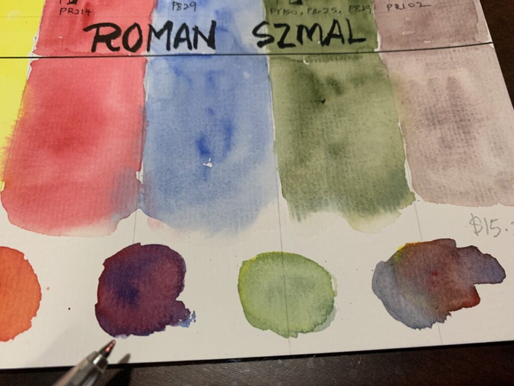
Most of the time, I don’t use only a specific watercolour paint brand as I feel it is so much fun to mix with different brand. For this piece, I am using Daniel Smith, Roman Szmal and Mission Gold.
FINAL THOUGHTS :
I can start to see that my style is a more loose compared to many professional Manga Artists. I don’t put in alot of detail works but I do focus greatly on the expression and the likeness against the reference of the character. That is really important to me.
Anime / Manga character emphasize alot on their exaggerated features like exceptional big eyes and extremely pointed chin and I feel this need to be focus when come to the drawing. I am not familiar in Anime / Manga at this moment as this is my first try out.But I do sometimes came across comics covers and flipping through the contents are really satisfying . There is a story behind in every anime/manga character and there is so much to know and learn in them.
Yes, there is more to improve on my character painting and that is only the beginning.
Below are the Jackson’s art affiliate link of the products I used on this. If you purchase from the link, I get some small commission but at no cost pass to you. This small commission allows me to make more meaningful drawing to share with you guys.
Lastly, below is the link to this speed drawing process and enjoy ! If you like my art channel, you can support me by comments , share and subscribe to my channel.Ciao !
Landscape painting can be tricky at times. I know what I wanted to paint for this week video,but somehow I was not always lucky to have my art completed in 1 video shoot. I have went through at least some significant handful of landscapes, mountains, fields and whatever I can find from pinterest for my reference. I have started a new stillman and birn sketchbook which I thought I was confident in making that kind of perfect painting , just like my etchr lab sketchbook on youtube. I was wrong. I made a mess of 2 pages on this new sketchbook and some failed on other papers as well.
I feel that the texture of the beta series just not suited for gouache painting as paint just glided on the surface no matter how carefully I try to blend my colours. I am not sure if anyone had tried this sketchbook for gouache painting and maybe you can comment in this post below. I was desperate to make this new video on gouache and I decided to discard this plan of painting on this sketchbook.
I decided to try the painting on this Fabriano mixed media paper which I have years before and here it is for this painting.
I still feel the colour blending can be improve. This paper is off white compared to the stillman and birn beta series. It is still not so bad to be used on gouache.
I tried to follow as exactly on the references but I still want to input some of my arts style onto it and I have always love loose painting. But I tried to be extra careful when come to gouache.
But when come to filling the tiny flowers, I just dabbled along following my feel.
Adding some fluffy clouds onto this painting using white. The link for the video is attached below and if you like my video, consider to subscribe to my channel and hit the bell for future notification . I hope you like it as much as I love making them .
Usually when you try to multi-task while painting and shooting video at the same time, there tends to have moment where you forgot to take some photos for your website. This is always happening to me and this time,I have totally forgotten to take photo for my art process of how I painted it and make them into sticker. Anyway, below is the only photo I have .
I am trying to challenge myself in trying to paint the smallest mountain scenery onto a 6.5 cm x 4.5 cm card stock .When painted onto a small area , clarity is very important. You will need to convey clearly what is the idea you want to to show to the audience. Otherwise , no one will understand what are you trying to paint. It was a nerve wracking moment , but I have to go on as I feel this was not a bad idea for this week video.
For this video, I have done 2 editing. One is a video around 9 min with the usual not too fast speed process with different rolls . But I feel, I want keep it a bit faster and decided to go with the speed of x 19. The outcome was not too bad and I found a cool music to go along with this fast speed video. Below is the 3 min video of how I paint and make the painting into sticker.
In this post, I am sharing with you how I paint my tiger process. This is a very fun and challenging exercise I encountered so far. The photo reference for this exercise was taken from my children’s book. Beside pinterest are great resources for drawing and painting photo, normally, I will also look into children encyclopedia or science reference book for drawing exercise.
For this painting, I am using Schmincke Raw Sienna . Of course there are many Sienna tone of colours or yellow Ochre out there. Winsor Cotman yellow Ochre is also a good choice where most of the time, I am using them for skin tone or base colours. Jackson’s art is a good place for getting art supply and I have bought a few times from them and thumbs up for their service. If you want to get the paint as what I use , you can click to the below affiliate link which is no cost to you when you check out.
This is an affiliate link which I earn some commission but at no cost to you .
Before the painting, I have carefully marked down the eyes, the stripes area. I feel whenever you are drawing or painting a animate subject , the eye expression is one of the most critical of all parts. Whether it is restless, unarmed, ready to attack or relax expression, it all shown on through the eye of the subject. Though I am not the expert of painting realism, but I always try my above ability to study, to observe this area.
I feel for beginner, you need to train your eyes to look photo reference and to observe the details. By the way, I am not always successful in whatever I drew. I learnt them through every video I made. I went to youtube to find how people are painting. I learnt drawing using a technique which always give me a higher chance of success in drawing with likeness. Speaking of this,maybe I should make a video about how to draw as beginner .
The scariest part of painting the eye is almost over, not bad. But I still find some challenges in using the smallest brush to work on small area. Oh yes, I have done a few layering of the Raw Sienna so that it get darker around the nose area to create shadow. Always lay the 2nd layer after the paper get dry,otherwise the wet brush may remove the initial paint you have laid earlier.For the black stripes, I am using schmincke payne’s grey . But frankly speaking, I feel ANY black paint work.
While waiting for the painting to dry before layering around the whisker area, I started to use a squirrel mop brush on the background. I am using Himi Jelly Gouache black as I want to create an even opaque against the tiger. For the white whisker, I am using the Sakura Gel roll 0.8 to lay over.
Below is the video how painted this. If you like my video, remember to subscribe and turn on the notification bell for future video.
I have done the watercolour swatch for Roman Szmal in my last video. Let’s try painting a dog this week using this set to see how the colours react. I find this photo of French Bulldog on pinterest. There are tons of dog photos on pinterest.Ok, if you are a beginner , when you are searching for an easy photo reference. Try to look for dog reference with short hair species. This one is an good example.Reason being, for short hair dog, you will have a better control on creating fur texture since it is quite insignificant if people notice about how you create the fur. For this exercise, I have using very short stroke to create minimal fur hair.It is not that essential if you do not know how. You will see how I paint as I explained further later. As usual, I always drafted the drawing before my painting.
I am using wet on wet technique on the facial area of the bulldog. At the same time , I have applied a thin layer of Caput Mortuum ( Roman Szmal ) as base colour. And I will slowly build up layer with darker tone. For this exercise, I am using Caput Mortuum on the dog’s face throughout this exercise.
I am using the liner watercolour brush to create very short fur around the facial. If you are not confident, you can just do without the stroke of fur. Slowly build up layer and folds on its face since bulldog significant features are folds and it’s droopy mouth. I am trying to create a balance between realism and also to incorporate my thoughts onto my arts. I feel the eye’s expression on any animals are really important as well. During the exercise, I am also trying to train my eyes to look for details like reflection.
The fun and more relaxed part is just painting the grass. I have mixed lemon yellow and ultramarine light to create a light green as base colour. And I slowly build up the layer by using a more muted green which is the aquarius green in this watercolour set. I have also noticed the french bull dog’s body has some minimal of pinkish skin tone at the chest area. I have use a very minimal of aquarius red and diluted with water to create a light pink . You also need to consider about light source and to create some shadows around its body. I feel it is really important as it will enhanced the depthness of your subject.
At last, this is the final piece and I simply love the colours . I have created this on youtube and you can watch my whole process. This video has minimal time lapse so that you can see it much clearer. I hope you enjoy this art as much as I love making it.
This is the set of watercolour that I had neglected so much. I have bought this set quite some time ago and had never a chance to try swatch it out. There are quite a few artist range palette and the one that I got is the aquarius starter set during a time of some offer from Jackson’s art store. Before that, I have never heard about it.
I knew some theory about colours and decided to swatch them out to see what can I get from this set.
I have created the swatching chart to see their characteristics. I found some information from Jackson’s art webstore that Roman Szmal was made in Poland and all their paint are handfilled and they only produced a small batches each time for quality control. And yes, thei paints only available in full pan size. And they are offering artist grade and with an affordable price compare to colours like Schminke . Quite impressive. What interest me is that most of their watercolour comes in single pigment.
That are not many brands out there offering many pure pigments. The colours in this set are:
1) Lemon Yellow PY61 2) Aquarius Red PR214 3 Ultramarine Light PB29 4) Aquarius Green PY150 , PBr 25 , PB29 5) Caput Mortuum PR102. And here I am trying to mix the 3 primary colours to see how vibrant I can get for the secondary colours. Since Lemon yellow and Aquarius red are in single pigment, I would assume I can get a bright orange. And indeed, I did get a vibrant orange.
I love the grey that the 3 primary colours ( yellow, red and blue ) are mixed together and I can still see the separation of each colours.
For the purple, it may be quite tricky and depends on how much you mixed with the red and blue to get the vibrant purple . I can also get a light green easily by mixing the ultramarine blue light and the Lemon yellow. So far, the pigment are easy to rewet EXCEPT for this Caput Mortuum.I need to rewet quite a few time in order to activate the colour.
Colours that are granulating are, Ultramarine Light ,Aquarius Green and Caput Mortuum. Depends on your subject of painting, it may not necessary that you required granulating pigment in every painting.
Overall , I love this watercolour set as they are so easy to mix to get a bright secondary colour and great for beginner if they just started out to learn about watercolour mixing. At this point of posting, this set is sold at USD 15.20( excluding shipping ). But if you are buying other stuffs, the shipping cost may not be too significant and also depends on where you reside.
Forest Animal – Made drawing easy is a bite size drawing forest animal book which is easily to read through. However , It is more suitable if you have some basic background in drawing. Great content sharing about animal drawing. If you do not like to read thick books on how to draw and those dry shading process, this is a good resource with only 64 pages.I love how details of the each drawing using pencils. There are also real photo attached in order to show you how the drawing is done.
About the Author : Maury Asseng
Maury was an inspiring illustrator who featured many of his work mainly focusing on anatomical illustration and cartoons for medical textbooks. In 2010, his artwork was featured in the Upstream people gallery’s 7th Annual colour.
You may purchase the book on Amazon US as per below link. I earn some commission with the link and there is no additional cost from you. Thank you for your support on this blog
Character Design from the ground up is written by video game designer later came illustrator Kevin Crossley. A very well written book about hos background and solid sharing of the author sharing his hobby since young. This is a book about how to came out with design ideas, concepts and projects driven process.
I love how the author presents his thoughts and tips on sharing his characters design process. This also includes he is giving ample reasons the ample reasons of why keeping traditional sketch books are essential on the growth as an artist.
I feel this book is more suitable for intermediate to advance artist.
Today we are going to draw and paint something interesting that is a vegetable stall in one of the wet market in Singapore.This stall was owned by my brother’s friend and he sent me the photo which I find it such a good idea for my next sketch.
This is not the usual vegetable stall which only sell local products but some of them like the carrots , raw tomatoes , mushrooms are freshly flown in from different part of the continents which includes The Netherlands, Australia and Japan.
From the above sketch, as usual, I had drafted out the subjects using graphite and then using my favourite Uniball Signo 0.38 nib gel pen to pen down the final lines.
At the top right corner, I decided to spice it up a bit by zooming in more details of the imported products and sketch them out using the Uniball Air pen. I love the variants of line thickness that this versatile pen can create. But if you are a beginner, it may need some time to practice on controlling the pressure on holding the pen.
Since this is a vegetable stall, I will inevitably using more green colours than usual. I have used Some colours like Sap green from Daniel Smith and Shinhan professional watercolour paint. I have uploaded the painting video in my youtube channel and if you like, you may check it out below.
This is an art book that I have been contemplating about purchasing it. The illustration images are enticing and colours are really vibrant which I really couldn’t stop flipping through each time. The author Sara Burrier is an artist , illustrator and teacher and she loved whimsical , fantasy subjects since at a very young age. In this book she shared about very useful tips for beginner and intermediate level artist about how to find resources, drawing/ colouring tips and creating mood board for inspiration . I have never come into my mind about mood board which I guess I will do that in the near future.
There are many drawing tips , drawing tools and how to draw fairies in a more believable ways.By the way, there are more than 75 tips that she is sharing in this book. I would say, this is a fantastic book and even if you are not into drawing and painting fantasies, I think it is still a good resource for artist and non artist to appreciate her arts and painting styles. There are also other artists who are also featured in this book.
She also owned a website saraburrier , check it out if you are interested in her work.
The link below are affiliate link, which means I earn some commission from each purchase, but at no extra cost to you. The money goes out to support this website so that I can continue to create more arts and sharing resources to you who are interested.
Unfortunately the book is not available in book depository and can only purchase from Amazon.The cover of the book is different from what is shown here but I have checked it out from the local library that the contents are same.
Hello Hi ! This is an announcement to share with you here that I have recently created a 2nd channel which is call Yen’s Bookhive I have always wanted to create a 2nd channel about art books flipping and here it is ! Do check it out if you are interested in art books . As this is a relatively new channel and it is still growing, the books are still very limited, but I continued to stay committed to bring to you guys about more art books.
If you have any suggestion about any art books in mind that you like me to make a video ( I will try my best to find it ) , please drop me an email at ywong.creations@gmail.com and I will get back to you soon. Meantime, stay safe and healthy.
Flower painting always seems so challenging to me. And today, I love to challenge myself on this topic again. Indeed, I ran into some blocks while painting this piece which I like to share over here. Gouache is always one of my favourite medium if I wanted to have some thick , rich paint effect. But I decided to use watercolour for the sky for this round and I thought creating clouds shouldn’t be that difficult. I was wrong . You see, before laying down the first colour, you need to at least pre plan about how you going to create that effect.
Any wrong move, may in the end cause you to ruin the arts that you intended to show to your audience . Sometimes, colours can be undone, but mostly, it just stay there and any additional layers will worsen the painting and become muddy.
So I guess, the ideal move will be to leave out some white space for the clouds. Since, clouds are mostly white on a Sunny day. It is just unnecessary to add in white over the blue sky. By the way, the blue I am using on this painting is Daniel Smith Cobalt Blue.
While trying to correct the colour and at the same time trying to record my video was a total disastrous moment and causing stress to my overall video recording.
I decided not to overdo the sky colours and continue with the rest with gouache paint.
By the way, the photo reference for this painting was from pinterest. I tried not to get too affected on the terrible painting of the sky and move on to the Sunflower paintings.
Finished the final portion on the stems. And below was the final painting. You can watch my process on this speed painting on my youtube channel.
Today, I am thinking of painting something funky and fashionable. I have done some research on pinterest and I thought sneakers are good ideas for some arts. So I decided to make another gouache painting again. And only after all my efforts done and uploaded onto youtube, I received a warning from youtube.
I will talk more on this later on this post. Let’s focus more on my art process now.
As always, I started to draft the positioning of my sketch to get the composition correct. This time, I have decided to make it a two spreads sketch and paint as I wanted to communicate more through my arts. The purpose of this paint is to show that sneakers are meant for all ages, be it hiphop, fashion , sports and more. The slogan always so true and the message of NIKE is so powerful and positive.For this sketch, I intentionally placed my subjects more freely.
I loved the colours of this HIMI Gouache set as so far. I didn’t have much issue about the colour mixture since the colours are sufficient for my arts. The only issue I think will be most colours had cracked.In fact, some cracks are more significant than others and some colours even shrink so much and it now left to 1/3 of the jelly cup. Other than that, I can re-wet them easily for repeated use again.
And now , coming back to the warning from youtube issue. In less than 1 minute after uploaded onto the platform, I received an email from youtube team . The letter roughly goes like this .
“We wanted to let you know that our team has reviewed your content and we don’t think it’s in line with our Community Guidelines. As a result, we’ve age-restricted the following content:
We haven’t applied a strike to your channel, and your content is still live for some users on YouTube. Keep reading for more details on what this means and steps you can take if you’d like to appeal this decision.”
I was totally stunned and quickly rewatched my video and trying to figure out which part had violate their rule. At the same time, I was pretty amazed and impressed that WOW, youtube actually was serious in every upload and every videos have gone through some vetting process with their AI tech.
Immediately, I switch my video to ” private ” as I do not want to meddle something that would hurt my channel. I started to go for appeal process to explain that my video should not be violating any rule since it is more towards arts and get them to review again.
After a few hours, I have finally received an email replying that they have reviewed my video and they see that it did not violate any youtube rule and they immediately apologise for this mistake and now my video is up and running without age restriction. With this incident happening, I told myself to be more mindful about making future contents .
I have made this video as #Shorts and I hope you guys enjoy watch the process. As usual, if you like my arts, you can support by clicking the subscribe and also to click the “bell”, so that it can notify for future new videos.
This is something that I have not try before, painting illustration using Gouache. This is really a relax and calming painting as I am letting go of any perfection. I am using loose shapes to represent my subjects .The colours I am applying here are just a layer without making further enhancement. The windows are mostly ” crooked” and I am using black to represent them.
The Gouache paint I am using is the brand Miya Himi . This should be a student grade gouache but the selection of colour choices are quite wide ( 18 colours ). I hope you enjoy the video which I created on youtube. My name is yen and if you like my videos, support me by subscribe to my channel , like, share and comment. Really appreciated 🙂
This was one of the challenging painting of Elsa using colour pencils so far. It was not easy for me especially I am not good in creating realism arts. The process was nerve wrecking and I did not know how to mix colours using colour pencils. This set of Faber Castell polychromo set colour pencils were bought more than 1 decade ago and I decided to revisit this medium again.
I could not remember why I bought this extremely expensive colour pencil sets in the first place. After drafting with light graphite lines , I decided to go straight into colour pencils.
I started trying out the hair colours using white and warm grey. Somehow, the colours seems strange initially. After some corrections, I decided not to overthink and went for whatever the closet to the original. Next Layering the skin colours was a much better process as I have some shades of skin colours to play with.
Lastly , it was time to doodle with little monsters using another medium, Copic markers. The ideas were to see how I can blend a character with fun doodling to create the chemistry on them.Result was not so bad. At the same time, my younger son also wanted to join in the fun and insist to draw Olaf , the snow man. It was such a perfect collaboration with my child.
Watch me paint this in youtube as below and hope you guys enjoy my arts.
This was a fun painting challenge that was set up by one of my youtube artist friend , astrid. I have not done any food painting before and decided to give it a try. This month challenge was food painting. The idea is to create arts or crafts related to food. I have no idea of what I going to paint , but feels that it can never goes wrong in just sketch and paint a burger. As this was a shorts video, I intended to keep it simple and within 60 secs time frame.Nothing fancy about shooting and editing portion. Watch this 60 sec short video in my youtube channel.
Today, I am doing a simple doodling for the starting of 2021. I am using a very old set of Copic Markers for this doodling. Though 2020 is a challenging year for everyone , but I hope 2021 will be year full of hope. So I have throw in blazing , vibrant colours in this doodling art to represent this. Cheers !
Click the link below to watch my doodling and colouring process.
This week I am making a special doodle to celebrate over 100 subscribers on youtube on Christmas day . It was a long journey to reach this milestone and yeah… just a small celebration:)
This inspiration came to me as I would like to doodle something that is really fun and cute. This is a classic story that was read again and again to my 4 yrs old. Lots of planning on what type of doodle characters to include. I would like to make some contrast on this doodle. If you may have already know, The Gruffalo is in fact a fierce monster ( in the story ) that all animals are afraid of. I also wanted to add cute doodles to have some sort of balance on my characters. I started off with pencil drafting which I normally do. I thought it was easy at first … more work along the way as I understand later that I will need to add so much characters that I was exhausted in mind, in researching as well as trying to challenge myself to finish within 2 days. I was totally stressed up.
It took me 1 and 1/3 days to finish up the drafting alone. I planned it in such a way that I also added some characters from Julia Donaldson’s other story books. Time for laying the ink onto my doodles.
I am using 0.8 mm Sakura Micron for the outline as I wanted to create some depth onto the doodles . Making some spontaneous thicker lines on some areas to make it more fun.
For the details of the doodles, as they are quite small , it will be better to use 0.05 pen, otherwise, the lines may collides with each other and smudged the images.
Catch me doodled this on my youtube channel as below. Support my art channel by Like / share/comments and hit the subscribe buttons for future videos. Thank you .
How to doodle in your way is always a challenging question for most people and I have seen tons of artists doing it and making a wave over youtube. I have done this doodle and may consider one of my favourite doodles so far. It is complicated but it is doable if you breaking down each into smaller doodles.
Just sharing my process on making this doodling.
1) Get a theme for your doodling
First, you need to have in mind the theme for your doodles. That is very important as this is the skeleton of your doodle story.
2) Drafting process
This is the 2nd step where you need to draft the doodle skeleton. I am using pencil to draft out the positioning and composition of the doodles. This is one of the important step as you do not want any mistakes that may affect the outcome of the doodle. If you find anything that need correction, just use an eraser at this stage
3) Differentiate the main characters as well as small elements
What I mean is you need to lay down the different position of your main characters and in between add in some spices like small elements( circle, wave, triangle, ribbon etc ). For my doodling here, mostly I am using the “droplet” shape as elements to create the flow.I am using some shapes like bubbles as well. You can use any type, go to pinterest to look for some inspirations.
4) Inking
This is the step whereby you should have already finished all your drafting . This involve using different variations of lines to make your doodles “alive”. Volume up the lines to make it more interesting. When you are doing some detail works, it is better to use the fine tip pen. I am using 0.05 , 0.50 and 0.80 felt tip black colour pen here. Make sure the pen you use are waterproof. Often, pigmented pens are waterproof, in case you want to use watercolour for your doodles.
Below is the final result of my inking process. I get the inspiration doodling ideas from youtubers like Robbie Art, Vexx and Gawx Art. They are really or in fact professional doodlers.
For my case, I did not use any cute or monster faces on this doodle, but using photos from places in Singapore and then randomly add in some elements in.
5) Colouring
This is the most fun part in finishing the doodle arts. Just add in colours that you like. Some people recommend to use the colour wheel as guideline, that is to use the colour opposite of on the wheel to get a harmonious colour effect. As my arts are mostly watercolour painting, I am using watercolour to try this doodling.
If it is too overwhelming, colour the doodles in small portion at a time. Colour it carefully and neatly to make the doodles standout. Another tip is to layer the colours starting from light to darker tone to make it look more 3D . Stop if you are tired and then continue again.
This is the final painting of my doodles. And it took me 5 hours to completion. It is so satisfying ! Catch me doodle this on youtube and if you like my art videos, support me by subscribe to to momwhosketch channel and hit the bell for future notification of new videos.Thank you
This is a simple palm tree painting at sunset that any beginner can try.This time, I am using both watercolour and gouache to create this simple piece of painting. Basically, I am using Daniel Smith Cerulean Blue to create a light blue sky using the wet on wet technique. I use this technique often especially painting a whole stretch of pain across the sketchbook. At the middle of the page, I am using mission gold orange and blend in with the blue sky. I am using more water for this sky painting to ensure the colour blend it well. In order to paint effectively using both watercolour and gouache, I have to plan in advance to select which subject to be watercolour and which one to use gouache. Bear in mind that watercolour mostly are transparent pigment and gouache are more opaque.
If I am going to paint the sky using gouache and the palm tree with water colour,It may not turn out well as the palm tree will not be able to stand out and will see through with the transparent pigment.
I added a tint of Peak cock Blue – Prussian Blue to create wave on the sea. I am using black gouache on the foreground of the painting which is the same colour as the palm tree.
For the leaves , I am carefully using “0” size brush to create the thin stroke of the leaves.
This will normally take more times as I need to create every single line and since I am using 100% cotton sketch book, the paper absorb the water really fast. I have to constantly wet my brush to avoid the dry brush stroke. For this painting ,I try not to overthink about how every strokes to be perfect, just paint with my feel and it was fun for the whole process.
If you want to see my whole painting process, you may click the youtube channel which was released last night. If you like my painting process and new to my channel, you may consider subscribe to my channel . Please hit the bell notification for my any upcoming new art videos. Your support is very much appreciated.
Recently I have bought the Miya Himi Jelly Gouache paint which have created such a wave around the world. This is the 2nd time I am using this. The first try was during my last video about how I draw created scene using character.
But the paint drys up so easily that it has obvious cracks on them( sorry for the disgusting photos below ). Each of the Jelly cube is 30ml which I feel is really alot. I bought on Lazada during sales time which cost around USD 13 and I paid for a very small shipping fee which is really a good deal. And the item reached me slightly a week which is pretty fast.
Though the paints are mostly cracked after my 2nd usage, but they seem to be easily rewet by using a spray of clean water. And instantly they are back to their initial form of jelly texture.
The colour seems very vibrant and there are total 18 colours and there are 2 white colors provided. One of them say is metallic white, but I don’t see much different. I may need to get a spatula to pick up the paint so that it won’t get contaminated by dipping into other paint using a brush. Below shows that after the colour is reactivated , it resumed back to its bouncy form again.
I nearly forgot to mention hoabout the extra well which was provided inside the box and it has a little hole so that you can just use your finger to remove the well easily. This is how thoughtful the design is. But the box is very heavy which I don’t think I will want to bring this box outdoor for painting. I will do a thorough reviews on the colours again in the near future.Stay tuned.
I tried this on another new painting idea that is mountain painting and this was really very satisfying after completed the piece. Actually most of the time, I prefer to use pencil and pen before painting . But since Gouache is opaque pigmented, I will just just pencils to create the initial draft and then followed by gouache. I try to be neat in this painting though.
I love how the colours turned out and they are really vibrant. I enjoyed mixing and testing out the colours and the final result. You may watch this latest video on my youtube channel with the link below.