Draw Super Mario Movie

Hello everyone ! It’s been awhile since my last upload. Yeah, I was away due to busy schedule, with work and also to get my hands dirty on drawings and to focus on getting my youtube channel monetized.And I am excited to share the news that I did it on the last day of Dec 2022!What a Journey! This is definitely not an easy one without friends supporting me globally. Thank you to their greatest support !

Today, I will be sharing my latest youtube video on drawing Super Mario Movie .This is a fun one with lots of vibrant colors to work with !

I have bought some blues sometime back while I was doing some art supplies shopping. I always thought how cool to have the caran d’ache luminance 6901 middle cobalt blue 660 which is a very common blue that drawholic use in many of the cartoon drawing.Then I decided to add on some more range of blues in case I needed them in the future drawings. All the colors are great except for Derwent Pro color which I am not sure why the pigment just glided on the surface of the paper and not fully blend onto the tooth of the paper.

Of course there are still a good selection of blues and reds from the prisma premier colored pencil series. Who don’t love this creamy pigmented colored pencils. For this Super Mario drawing, I have included some really great student grade Faber Castell Classic green. They are by far one of the best affordable student grade colored pencils in the market.

Below is the drawing video and if you like this, please help to support my channel by subscribe for future art video and give it a thumbs up .Thank you !

Posted in Drawing Tools, Sketches | Tagged , , , , , , | Leave a comment

Puss In Boots ( The Last Wish )

This is the animation movie Puss in Boots , The last wish that I am looking forward to. It will be premiered in Singapore before Christmas, so exciting. That is the reason I feel it is just right for me to draw this before it will be shown in Cinema Globally.

This is not a difficult drawing but the tricky part maybe the furs that will normally make me caught up with. For such iconic animation cat, I will look up for the landmark which is it’s cheeky look and to put that all into to make it more realistic.

For this drawing, I am using mostly prisma colored pencils and I guess that is the best choice so far.

Below is the end result. Frankly speaking, I really love the rustic silver sword looks and I did made some changes on the glowing colors on Puss in Boots . It looks brighter compare to the original poster. Below is the youtube link for this speed drawing and hope you guys like it.

Posted in Colored Pencil Art | Tagged , , , , , | Leave a comment

Drawing Jennie Black Pink

This was drawn 1 week ago using kraft paper sketchbook.I feel kraft paper is something that will help beginner portrait artists alot. And it really help to speed up the coloring process.This is the hahnemuhle brand A5 size sketcbook.I bought it from my local art store . I can’t remember the price but I don’t think it was that expensive. It was fun to use on drawing portrait as the paper can act as the base color as skin tone.

This is quite a quick drawing and coloring as this is not a full colored pencil sketch.This paper is 120 GSM and I have done numerous highlighting and erasing and the paper seems able to withstand some rubbing and tearing.

Below is the time lapse coloring process on Jennie fro blackpink I have done on my youtube channel. Do remember to subscribe if you have not done so.Thank you for you support

Posted in Colored Pencil Art | Tagged , , | Leave a comment

Draw And Color Rainbow Chameleon

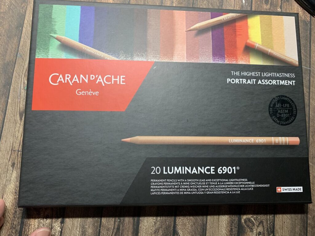
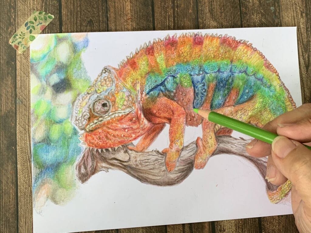
This is something that I find that it is fun which I am trying to play with rainbow colors on my drawings.So I have decided to try this chameleon drawing and coloring. The purpose of this rainbow theme is also that I am trying out the caran d’ache portrait assortment set which I have bought from Jackson’s art store recently.

This is my first go to online art store whenever I am trying to purchase some new art resources.They may not be the cheapest sometimes, but you definitely need to check out some weekly sales which they will put up on their website. In the future post , I will share more about swatching and my first impression on this portrait assortment luminance 6901 set. Fantastic.

I think many colored pencil portrait artist will be very familiar with Caran d’ ache luminance 6901 set. Below some of the photos taken during different stages on how I tackled using my method on layering.

The colors on the chameleon are really easy to work on and extremely vibrant.

Some of the tips I can share here is try to layer them step by step. Always starts with using very light pressure and slowly and gradually working on your strengths. But I find that, if there is any mistakes, they can be easily removed just using any normal eraser.

As Chameleon skins are covered with scales and some little lumps, I am trying to put all these details onto the the drawing. Though , It may take up lots of time, but it can be fun if you like to draw details.

The coloring process can be found on my youtube channel. I have break up the coloring into 2 different videos.One is just the chameleon and then further on the 2nd video will be how I create blurry background. Hope you guys like it.Thank you for supporting my channel 🙂

https://www.youtube.com/channel/UCOsexq41H8U3bZuSNUItvuw

Below is the purchase link if you are interested in the caran d’ache luminance 6901 20 sets ( portrait assortment) as well as the canson bristol illustration papers which I normally work on.

https://www.jacksonsart.com/caran-d-ache-luminance-6901-colour-pencil-set-of-20-portrait-colours?___store=jacksonsart_en&acc=af21d0c97db2e27e13572cbf59eb343d

https://www.jacksonsart.com/canson-xl-bristol-spiral-pad-180gsm-50-sheets-a4?___store=jacksonsart_en&acc=af21d0c97db2e27e13572cbf59eb343d

Posted in Colored Pencil Art, Other Resources | Tagged , , | Leave a comment

Draw Turkey Bird _ Artist Collaboration

This is one of the most challenging drawing that I have ever done for artist collaboration. It was fun making art during this period as I am always looking forward to with my fellow artist friends. This time, we make it more fun by drawing lots and then to swap the art style with the artist that was chosen. For me , I have swapped with one of my artist friend which she has chosen her past art , that was a turkey and I was suppose to recreate it with own style.

It may looks easy at first, but when you really sit down and try to study the features of turkey bird, you started to panic looking at the details, from the eye , wattle to feathers and you know that this is not going to be easy. And the best part was, which colors to use? which were the base colors and the patterns of the feathers were just too overwhelming.

I am using mostly prisma colors for this as they offered the wider range of choices compare to my faber castell polychromos . I am not sure if this is due to the nature of the pigment, they seems to fade away quite easily and I have to keep re layering the colors to make them brighter.

I love the overall result especially the patterns of feathers . This whole drawing and coloring took me around 9.5hours .You may watch my full process in time lapse in the link below.Hope you guys like it.

Posted in Colored Pencil Art, Drawing Tools | Tagged , , | Leave a comment

Watercolor Portrait

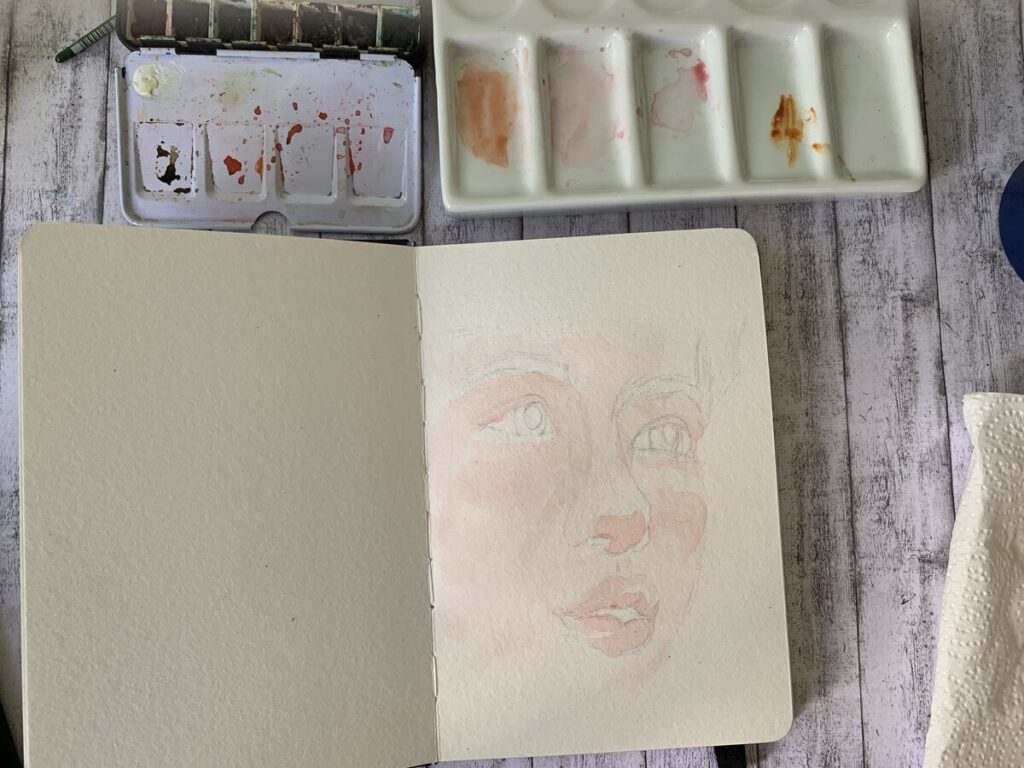
In last week video, I have decided to try watercolor as the request came from my friend.

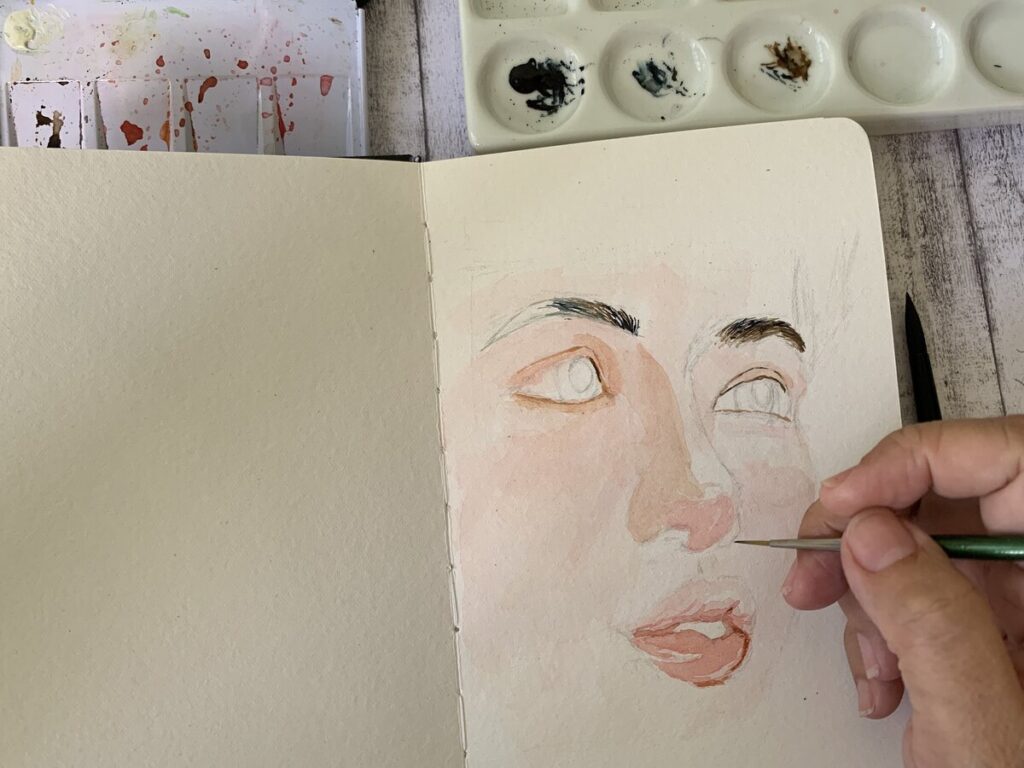
For this painting, I decided to give her a delicate feel and not working too dark as in the past.For watercolor, it is always advisable to work from thin layer to dark due to the properties of the pigments. In this portrait painting, I was using the mission gold permanent red.In order to create that delicate skin tone, I have mixed more water to the permanent red than usual.Speaking of the watercolor sketchbook I am using here, it is the Kuelox 300 GSM cotton paper( 130 mm x 190 mm ).This is an affordable watercolor sketchbook and the quality is fantastic! In the future, I will be doing more reviews on this sketchbook.

After the 1st layer, I started my 2nd layer focusing more on the shadow area as well as the eye brows. The technique here is quite straight forward, that is just use lesser water and abit more pigment. You can also just repeat my earlier stage by just layered thin permanent red over the 1st layer. The trick still ,is not to overwork , but just layering slowly. Using this 300 GSM is beneficial especially for beginner artists. You don’t have to worry too much on tearing the paper or causing wobbling of the paper due to too many layers of water.

When comes to details, I always used colored pencils as they are way much easier to control than just a watercolor brush. Below is the purchase link for Mission gold 9 set. This is my 1st set of artist grade watercolor since I used 3yrs ago. I have also attached my video link for this process .Hope you guys love and remembered to subscribe to my channel for more future videos.

https://www.jacksonsart.com/mijello-mission-gold-watercolour-paint-7ml-set-of-9?___store=jacksonsart_en&acc=af21d0c97db2e27e13572cbf59eb343d

Posted in Watercolour | Tagged , , | Leave a comment

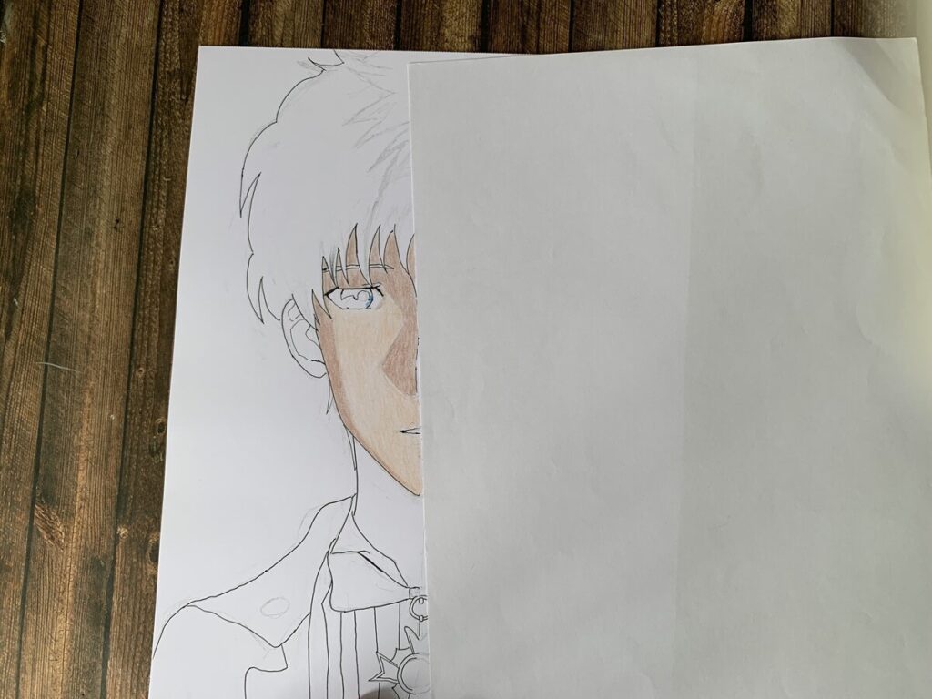
Tuxedo Mask Vs BTS Kim

This is a fun drawing again with Anime Vs Portrait Style.This time,I have decided to choose 2 well known characters and put them together.

I am using a black 0.1 mm pen in this Tuxedo Mask drawing on the left side.And then work with the rest of the details using colored pencils. Black colored hair was a challenge as you need to be careful in slowly layering the black with grey and black. If just using a black alone , it may turned out flat.

I love to draw more portrait and always feel it is much more challenging than anime. Anime character’s line works are more straightforward while portrait you really need to drill down in looking at the proportion and more detailings are required in terms of skill level.

Next came the drawing of BTS Kim. Overall , I feel his eyes and eyebrows are the most difficult part to tackle.

The color pencils that I am using consist of various brands like, prisma, polychromos and carand’ache. If you like this, you can watch my time lapse video on youtube with the link below.

Posted in Colored Pencil Art, Sketches | Tagged , , | Leave a comment

Drawing Eleven from Stranger Things 4

Recently I have completed this drawing of Eleven from this top series Stranger Things 4 from Netflix. What I know that it has caused such a wave that many artists started to draw different characters from this hit series. This is definitely a trend in the portrait community.

For this drawing I did not following exactly the skin tones from the reference photo. I am using a bit of Chris Hong’s colouring techniques here and I am looking forward to see how it turns out.

For realism drawing, I have to draft out the full details carefully in order to achieve at least 80%of likeness. I agreed, sometimes I have missed some important landmarks which make the final drawing slightly off.

I feel the overall effects were a bit too delicate ?I can definitely see the delicate skin tones through the paper .I think I am quite satisfied the overall feels of delicacy and I feel that it somehow bring out my styles of how I stylized this portrait. This is not easy always easy for me and sometimes I have difficulty in telling the exact colors or what colors should I be using.

I believe this will comes with more practices and to train my eyes to learn how to decipher the color codes. I am someone who don’t believe in using the same brand throughout my coloring process. I love to see how different brands of colored pigments react together when I mixed them. For this drawing, I have mixed with prismacolors, polychromos and caran d’ache luminance. Fantastic ! I love to make this kind of drawing in near future.

I hope you can support me by subscribe to my channel so that I can make more videos just for you guys. I hope you enjoy this drawing as much as I love making it.

Posted in Colored Pencil Art | Tagged , , , | Leave a comment

ANIME VS REALISTIC PORTRAIT

This was the 2nd series of Anime Vs Realistic portrait that I am working on it few weeks ago. Sometimes I get idea from Instagram on this kind of drawing. It was fun though to visualize the final result. This time round, I have decided to draw Sailor Saturn in anime and then transform her to realism.

Actually , I have no idea Sailor Saturn does exist. All the while , I only thought Sailor Moon was only the blond hair girl with a magic wand with sailor suit. Obviously , I was wrong.

For this kind of merging drawing, sometimes it is up to you to decide which side should be the anime drawing and vice versa. For them to merge well together, I have to lay them in pencil draft so that they are about in the same position. But I have to highlight that , due to different style of characters, they may not be in proportion. It is always unrealistic in anime compared to realistic drawings. The eyes always appears twice as big as realistic person and the lips are mostly represented by thin lines only.

Overall, it is always challenging to draw a realistic portrait then anime or cartoon styles as their lines are way not as complicated as portrait. It took me quite awhile to get that eyes, lips nose correct for the portrait drawing.

I feel that I can do it better by shifting the anime just an inch down to make it at least aligned with the realistic side. The drawings are completed. Below is the link to my youtube channel.Thanks for your support always.

https://youtube.com/shorts/oWslDpuCaVs

Posted in Colored Pencil Art | Tagged , , , , , | Leave a comment

Collaboration on Childhood Memories

This was an artists collaboration a week ago about drawing our childhood memories. This is interesting at the time challenging as sometimes drawing children and adults are quite different in proportion. And most of our memories are so far away and most of us couldn’t even remember much, unless you have old photos to help in your drawings.

For myself , I have some vivid memories but I don’t have photo to support on my drawings.So this is quite tricky for me. Since I am into portrait drawing ,I need to find a photo reference that can help me to “speak” about my memories to my audience .

So this is where I started to plan on putting more of my concept here. I planned to give it a more dreamy look for this drawing .Previously, I have collected many photo references in case( even if I am not drawing that reference ) I needed to use that one day. So here it is.And I wanted to put my family inside but not distracting the whole focus of the portrait . The idea is to kill 2 birds with 1 stone in this and I feel quite satisfied with the final concept.

The material use here is basically canson illustration bristol paper ( smooth ) and polychromos colored pencils and some caran d’ache luminance colored pencils

The video on this collaboration can be found on my channel . All artists channels can be found in my video descriptions.Thanks for your support to them and to this channel.

Posted in Colored Pencil Art, Other Artists | Tagged , , | Leave a comment